Bored and curious

rdzmzda

TPF Noob!
Joined
Jan 26, 2008
Messages
364
Reaction score
1
Location
Oklahoma
Can others edit my Photos
Photos NOT OK to edit
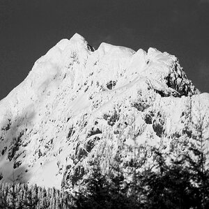
Have not done this in forever so figured I'd put up some of my work again for critique what you all think?
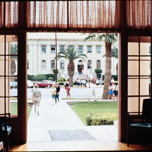
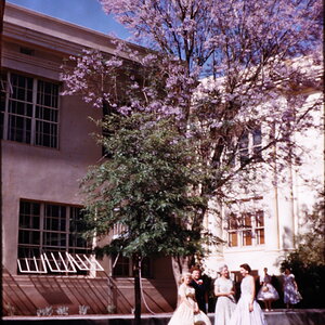
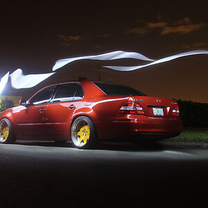
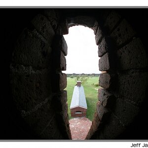
Which one you like better now that I aded the last three A B C or D?
A
swingblue.jpg

B
swingred.jpg

C
swingbw.jpg

D
swing.jpg
 
Last edited:
Though the selective coloring is done alright, i think i would prefer the shot if it was all black and white. usually selective color is used to draw emphasis to a point in the photo, i dont know why you want me to focus on the swing lol.

i like the shot, mind posting an all b&w or all color shot?
 
Ok I added all the different versions of this photo I have
 
3rd.

as stated by tyler, selective coloring should be used to draw focus to the subject you want the focus to be on.

with the child being the obvious subject, the colored swing in #1 steals the spotlight, and on #2 his jacket is just way too overpowering. the color in the last is kinda funky (wish i could think of a better way to describe it, sorry). so either the 3rd, or a proper colored image would be best.
 
Since I cannot see the child's eyes, I feel this is more of a somber mood type photo. With that, I would also like to see this in black and white. Right now, I like C the best.
 
In the blue swing photo the swing is the subject that draws the eye. I think it needs to be the boy.

The red shirt photo would be okay, but red is about the most powerful color out there. I think it's too strong. Too much of an attention grabber. It isolates my vision to the shirt, instead of the boy as a whole.

The all BW is my favorite.

I like the colorized version better than the selective color versions, but that red is still really strong. I'd tone it down, and bring a little warm color into the skin.

In my opinion selective color works best when you are coloring the main subject. If you color anything but the main subject you have turned it into the main subject. Particularly if you color it red.

Another thing to consider is that color is relative. Merely placing color next to neutral monochrome effectively causes the color to look extra saturated to the viewers' eyes. If somewhat desaturated colors are used they will still look very colorful next to the monchrome, yet not be too strong.
 
The selective color shots do nothing for the image. They in fact detract from the face, which is important in this shot precisely because the subject isn't looking at the camera. The viewer has to strain to infer the expression based on the angle.

The last, mostly-colored/but slightly desaturated image falls on the wrong side of the 'artistic to zombie' continuum.

Stick with the black and white, it's really the strongest of the bunch.
 
The "funky" coloring on the third one was intentional I was going for a classic kind of technicolor look not sure I quite got it. I'm thinking I may try to selective color just his face and see how that works out. Thanks for the input
 
Since I cannot see the child's eyes, I feel this is more of a somber mood type photo. With that, I would also like to see this in black and white. Right now, I like C the best.
+1

I think is perfect in b&w

Great shot!
 
Personally I love the way D came out. It's an interesting photo but the editing of the colors makes it very compelling to me anyway. I could see that at a hallmark store on the front of a card

-tim
 
I like the colour version as well, but hate the grass in it. If you desaturate the green channel a bit or make it more consistently green, it will look much better IMHO.
 
The last one is the one I like. I agree that the selective color ones is takes away from the picture. The black and white just does not do enough for such a nice shot. But the color one gives just enough character to the photo. :)
 

Most reactions

Back
Top