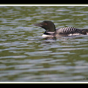
I really like the concept here; I might dial back the processing on the clouds a little and maybe crop the bottom to get rid of the deep shadow on the LH side bottom, but the composition and overall look are very good.
I've looked at this several times since you posted it and I'm not sure how I feel about it. I really want to like it, because of the strong visual elements, but at the same time it's so in your face that it makes you a little uneasy as if you're about to be run over.
On the positive side - I like the subject and your concept and the processing. Just a few things with the execution that are off, IMO...
The original comment about it being unbalanced was not mine but I do see what she meant. A subject like this begs for symmetry and the angle on the right side appears slightly different than the angle on the left.
I think the crop is too tight, not enough room at the top and too much "up" perspective. My neck hurts just looking at this one on my screen.
As usual, I disagree with the "crop it square" crowd, lol. Square is too square for Square.
Thanks SquarePeg. I think the shot deserves more of my time. At the time of the shot there were cars parked on the pavement which made it difficult for me to get back (they aren't usually parked there). Also, I had to rotate the initial shot meaning I lost space at the top. The point just about fits in.
I was central but I think the building shape gives that unbalanced impression but at the end of the day if the eyes see it as unbalanced then it doesn't matter. I think I'm going to go back here and give it another go as I see great potential! Might have to sneak onto the road for a few shots
I was central but I think the building shape gives that unbalanced impression but at the end of the day if the eyes see it as unbalanced then it doesn't matter. I think I'm going to go back here and give it another go as I see great potential! Might have to sneak onto the road for a few shots


![[No title]](/data/xfmg/thumbnail/34/34061-e097813b3719866d07ff3e78e8119ffa.jpg?1619736258)
![[No title]](/data/xfmg/thumbnail/37/37103-871e5d39d6f585e3019a4e25eb2ee935.jpg?1619737882)
![[No title]](/data/xfmg/thumbnail/34/34063-09779b4ba56a0acb2b0fa36cf8720dfb.jpg?1619736260)
![[No title]](/data/xfmg/thumbnail/34/34064-66d345cd6eebe4b9f97597e03008d3b7.jpg?1619736260)