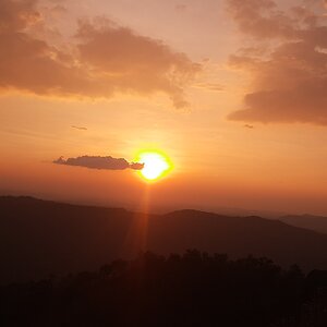
I really dig this an abstract, but i will say you may lose a few people with the title. I love form and shape of this. The fact that you can't make out what the objects at first glance adds to the mystery of the photo.
My nitpick would be to include more of the bottom; i see a subtle reflection of a mirror there, i personally would like to see more of a reflection. and perhaps cut a bit (just a bit) of the black on top.
Thanks for the help mark! I hate the title to, but I couldn't think of anything, like not one other possible title .
I often wonder if my monitor is brighter then most peoples... because the general comment on all of my pictures is that they are too dark, but I never seem to think they are that bad :S.
I like your idea about including more of the bottom to and less of the top, I think I'll give that a go, maybe make it a tad brighter.
I like this photo. The Mystery made it all the more endearing once I recogonized what I was viewing. I agree that to have included more of the reflection would have been interresting as long as it didn't make the identy more obvioius.
I like the darkness of it all but just a tad lighter to vaguely show an outline of the tops of the gloves would have wokred better for me. Maybe its just way I'm seeing it over here though?


")

![[No title]](/data/xfmg/thumbnail/33/33847-620ea3a471c8ec2ae89451f9ee9dcb84.jpg?1619736166)
![[No title]](/data/xfmg/thumbnail/37/37608-63b0d340b0972479217b548a4026df96.jpg?1619738149)
![[No title]](/data/xfmg/thumbnail/37/37630-10bda987ab220dc60e7c1cb65502f83c.jpg?1619738155)