JackRabbit
TPF Noob!
- Joined
- Dec 13, 2009
- Messages
- 236
- Reaction score
- 1
- Location
- Southern California
- Website
- www.flickr.com
- Can others edit my Photos
- Photos OK to edit
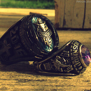
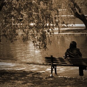
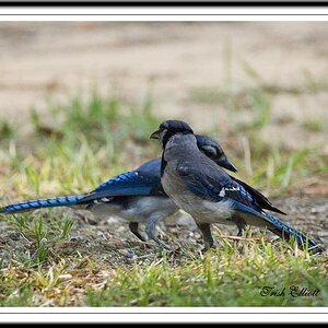
Ok, I have only been into photography for about 3 weeks now, and I can already tell I am in love. But regardless, I have recently been taking more and more pictures and am in desperate need of constructive criticism. You can only get so much of that from friends on MySpace haha. So anyways, did a quick google search, and found somewhere where the people know what they are talking about and would be glad to help me. So with all this said, PLEASE give me some tips and things to work on for my work up to this point; which, by the way, is about 10 photos ahaha.


Also, add me as a contact on Flickr. I'd love to be able to see some of you guys's work.
My Flickr
Also, add me as a contact on Flickr. I'd love to be able to see some of you guys's work.
My Flickr
Last edited:
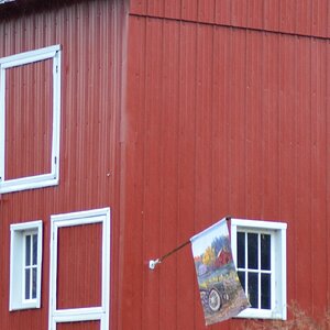
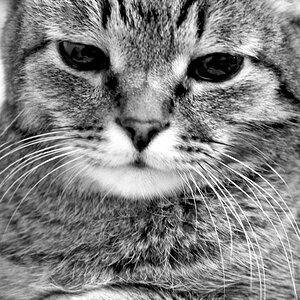
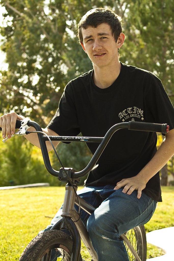
 ) or BW. You shot at low level - something that many people don't do for full length - GOOD FOR YOU - not everyone understands lens distortion but too low for image like that. Composition ok, since you UNLIKELY posed him - no comment there. But again, in color, this image doesn't do anything for me.