Bright, Fun, Funky - Family Portraits

twocolor

No longer a newbie, moving up!
Joined
Feb 26, 2008
Messages
1,044
Reaction score
227
Location
Utah
Website
www.twocolorphotography.com
Can others edit my Photos
Photos NOT OK to edit
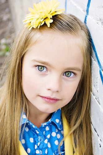
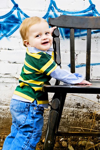
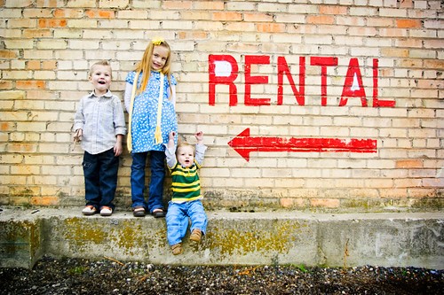
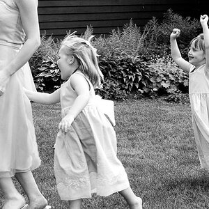
This client came to me with SPECIFIC ideas and images of how she wanted her portraits to look. The day before our session, she called me and walked me through some websites she had noticed with the same style of portraiture that she wanted - which was quite refreshing to have a client know exactly what they want out of their session. She wanted super saturated, bright, fun, funky and URBAN. She had a special request for graffiti if I could find any.

So, after the search through neighboring towns (no graffiti inthe small town I live in :D) to find the venue, and an hour and a half of shooting, here are the results. She saw them last night, and was tickled pink!!

1.
4096535416_1c49539a79.jpg


2.
4095775035_a8f7b61f76.jpg


3.
4096536108_b015d450ef.jpg


4.
4095775875_e6c703e2f2.jpg


5.
4096537042_ce1123de18.jpg


6.
4096537848_f0421526d5.jpg


7. And my favorite!!!
4095778035_7e93c162e8.jpg
 
Wow--my eyes hurt! 'Do's got some colorz!

The last shot with the kids and the sign and arrow <Rental is fun,and funny.

Your color palette normally pops! quite healthily. Will these even print without being out of gamut and looking a bit odd?
 
Wow--my eyes hurt! 'Do's got some colorz!

The last shot with the kids and the sign and arrow <Rental is fun,and funny.

Your color palette normally pops! quite healthily. Will these even print without being out of gamut and looking a bit odd?


:lol::lol:

yeah, I know!
I've got a high end developer that NEVER lets me down! I will probably suggest printing them on some metallic! Mine were quite tame compared to the ones she showed me!
 
That last one is absolutely fantastic and fun. I love the close-ups of the kids too. I wish the family portrait (first one) was cropped in a little more and you might wanna straighten the tilt. Other than that, I love 'em :)
 
I love all of these! They are so far away from something traditional, they are FUN!

The only one that bothers me is the couples kiss, it looks awkward. I just looks like a second before the kiss. Did you catch and shots where their lips made contact?

:thumbup: :D
 
They just feel too overprocessed to me. The first one, there's so much going on that it's hard to even find the people in the picture. The second one, the skin is too featureless, and they eyes seem over worked. It seems to me that you like to push your skin tones really close to clipped, which I guess is a style choice, but it's not my bag.

The last pictures is so awesome though. Great idea.
 
Love the idea
Colors and exposure are a bit painful on my eyes though :sexywink:
The first portrait, i'd crop in a bit more since the wall takes AWAY, from the people.
GREAT JOB!!!
 
I love all of these! They are so far away from something traditional, they are FUN!

The only one that bothers me is the couples kiss, it looks awkward. I just looks like a second before the kiss. Did you catch and shots where their lips made contact?

:thumbup: :D

Thanks!

I was taught a couple of years ago that the perfect kiss shot leaves the viewer wanting. The kiss "rule" that I use with all of my client is to not quite touch! If the couple is actually kissing, you get mashed noses, and lips. And quite honestly, some couples aren't pretty kissers :lol:
 
They just feel too overprocessed to me. The first one, there's so much going on that it's hard to even find the people in the picture. The second one, the skin is too featureless, and they eyes seem over worked. It seems to me that you like to push your skin tones really close to clipped, which I guess is a style choice, but it's not my bag.

The last pictures is so awesome though. Great idea.

Yes, I do very often push my skin tones right to the edge :blushing: Personally I love it, I feel it draws attention to the eyes. On that second shot, all I did on her eyes was a selective sharpening, that's it!

You should see some of the portraits she had printed out as samples. Mine would be considered quite tame. Most of the sample prints she referred me to were completely blown in the skin tones, and the colors were even more extreme than mine (hard to believe, I know).

I really try hard to read my clients and give them what they want. I feel that I gave her exactly what she had in mind!!!
 
Love the idea
Colors and exposure are a bit painful on my eyes though :sexywink:
The first portrait, i'd crop in a bit more since the wall takes AWAY, from the people.
GREAT JOB!!!

Thanks!

I'll crop in on that one, and do like Lyncca suggested and straighten out the horizon while I'm at it!
 
I love all of these! They are so far away from something traditional, they are FUN!

The only one that bothers me is the couples kiss, it looks awkward. I just looks like a second before the kiss. Did you catch and shots where their lips made contact?

:thumbup: :D

Thanks!

I was taught a couple of years ago that the perfect kiss shot leaves the viewer wanting. The kiss "rule" that I use with all of my client is to not quite touch! If the couple is actually kissing, you get mashed noses, and lips. And quite honestly, some couples aren't pretty kissers :lol:

Good answer. I can see how too much action wouldn't be appealing.
 
They just feel too overprocessed to me. The first one, there's so much going on that it's hard to even find the people in the picture. The second one, the skin is too featureless, and they eyes seem over worked. It seems to me that you like to push your skin tones really close to clipped, which I guess is a style choice, but it's not my bag.

The last pictures is so awesome though. Great idea.

Yes, I do very often push my skin tones right to the edge :blushing: Personally I love it, I feel it draws attention to the eyes. On that second shot, all I did on her eyes was a selective sharpening, that's it!

You should see some of the portraits she had printed out as samples. Mine would be considered quite tame. Most of the sample prints she referred me to were completely blown in the skin tones, and the colors were even more extreme than mine (hard to believe, I know).

I really try hard to read my clients and give them what they want. I feel that I gave her exactly what she had in mind!!!

Do you mind showing us where your client got her inspiration? I'm curious about these even more extreme colors.
 
that last picture is hilarious... haha :D
 

Most reactions

New Topics

Back
Top