Building an example portfolio. (Critique needed)

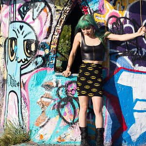
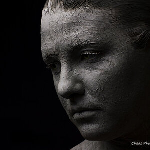
Those guys are me, so careful when commenting the hair. :p

Thanks for your comments skieur. I tried to be careful with the eyes, but I generally didn't feel like looking at the camera. I was mostly using these shots to work on some post-processing skills, lighting (which apparently didn't go so well, but there's always next time, and I'm gonna order me up some umbrellas soon), and you know, general stuff. Is the skin THAT bad HAHA? Should I get a third SB-800 to set up behind the subject to separate the subject from the background, or what? Perhaps it's just 'cause I was so cramped in my room, or does it usually take a light from the back? Or how do I get the subject separated?
 
I don't know if I mentioned this yet at all... and it's a follow up to my Foghorn Leghorn Friend ;o).

If you're investing in flashes like crazy, why not get a cheep studio kit. You'll fine that it's very versatile but yet, not portable really for some location shots. I keep mine (similar to this one) and it goes everywhere I go for portraits. I just keep extension chords handy for this stuff.

I am setting up today for a 2 week portrait shoot and I'll sen you along some photos of the setups (in another thread).

David.
 
i read the first couple of posts, but they are all pretty long-winded, so if this was suggested, oops.

speedlights as a main or key light source are almost always going to be harsh when used direct.
what i'd do, is bounce one off the ceiling or an overhead reflector, and one of a nearby wall (or at-the-side reflector) for fill light. your shadows will still be kind of hard, but easier to control, imo.

you can also get umbrellas rigged to fit speedlights, and the sb800 has enough power for a small or medium softbox, too.
 
I don't really want to be harsh here but I guess I have to. The images you have presente here look nothing like anything any one is going to want to buy as a senior portrait. The lighting is harsh and in a couple of them coming from a direction that would be more appropriate for a horror film if you want to sell people on using you as a protrait photographer you really need to work on softening your lighting and post-processing your images but again I really did not want to be harsh.
 
I don't really want to be harsh here but I guess I have to. The images you have presente here look nothing like anything any one is going to want to buy as a senior portrait. The lighting is harsh and in a couple of them coming from a direction that would be more appropriate for a horror film if you want to sell people on using you as a protrait photographer you really need to work on softening your lighting and post-processing your images but again I really did not want to be harsh.

I did post-process. What else should I be doing with post-processing? This is exactly why I'm posting on here, so I can learn. So, I've got to soften the light (I think we've all established that quite well by now. HAHA). But what should I do with the post-processing? I have PhotoShop CS3, but I'm not too good with it. But, I mean, what kind of things should I be doing to photos if I want to market for senior portraits? I'm gonna get some umbrellas soon, and work with those. I have a fair number of months before senior portrait time comes around, so I've got to work all this stuff out. Thanks for the response, and don't worry about being harsh. I'm 16 and ignorant, so I'm not coming in here expecting to get critique less than harsh, so seriously, let me have it. :]
 
You need to work on smoothing out skin tones. Do a search online for smoothing skin in PS and you find a lot. try to find one that does not involve using a glaussin Blur.
 
I spent twenty minutes on this image in PS. Is this any better, post-processing wise?

Before:
_DSC5601-Edit-2.jpg


After:
_DSC5601-Edit-3.jpg
 
Jeremy... I think you might want to put this photo to rest because of the fact that the single light shot cast shadows where it is hard to correct.

I would hop off the computer real quick, grab your camera and go take a quick photo of your mom or dad in a well lit room and try that out for practice sake.

Here's a better offer. I was setting some levels with my youngest tonight for a shoot I started. This is SOOC and has just been resized. I haven't done a thing to it! The background is black striped. Go nuts! She's 13 tomorrow so is a great skin correction candidate.

attachment.php
 

Attachments

  • $030608 Photos 197 copy.jpg
    $030608 Photos 197 copy.jpg
    177.3 KB · Views: 173
Thanks Joanna. I sure hope it warms up soon. Although, Maine doesn't warm up too fast, unless you're on the coast. But, I see you're in Ontario, so I'm sure you know all about cold weather.

So, here's another shot...with a bit different lighting approach. The head position is bad, I am aware of that, and I'm tilted a bit up over the camera, which was sort of an accident. I'm a photographer at heart, so getting in front of my camera is sort of difficult HAHA. But, how's this lighting approach? And I know I should have had a light behind me to really set me apart from the background, but my room is so cramped, so it's tough.

_DSC5617-Edit.jpg

This might be off topic, but here's something...

The LOGO... I saw it as a Photoshop Vector Shape recently, and liked it. In the past week, I have seen that SAME logo on SOOO many cheap items (WalllyMart clothes, bad photography, beginners websites, etc.)

Anyway, It's just out there tons...which is bad, because it's not unique. Second, since it's a cool design that's free and doesn't take much work to create (select shape and make it big)...it is used for lots of cheapo things.

Don't get me wrong...I like it...but just a heads up that it's used a lot.
 

Most reactions

New Topics

Back
Top