business cards

wxnut

TPF Noob!
Joined
Sep 9, 2004
Messages
594
Reaction score
7
Location
Wisconsin
Website
www.dougraflikphotography.com
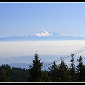
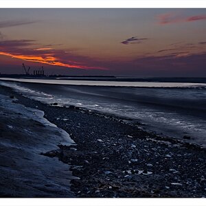
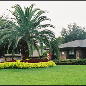
Not sure if this is the wrong area for this thread, but there are pictures on them. Here are my new business cards I just orderd. I wanted to have a different card for each avenue of photography I did. I did one for concerts and bands, Weddings, and a general one for everything. What do you think?

1.
musicbusinesscards.jpg


2.
businesscard2s.jpg


3.
generalbusinesscards.jpg


Doug Raflik
Doug Raflik Photography
http://www.dougraflikphotography.com
 
The card sizes, that is the relationship between width and height, seems off. May cause trouble for people wanting to stick 'm in some sort of standard sized business card box. More than half of those people won't bother and simply chuck your business card...
Try to use no more than 2 sizes fonts/letters.
In the 3rd card there's a comma after 'PETS'. Why?
 
Sorry, but I think they look naf(spelling??) and cheesy
I would have had a futuristic modern font, with no picture on the card.
I dont think you really need to have a pic on the card to like, show your photography. ALso, why did you make them vertical?
 
Well, I actually like these. Other then your coma after Pets I think the rest of it looks good. Are they regular business size cards? Hey, personally as long as a business card fits in my wallet thats all that matters to me when I take someones card.
 
W.Smith said:
The card sizes, that is the relationship between width and height, seems off. May cause trouble for people wanting to stick 'm in some sort of standard sized business card box. More than half of those people won't bother and simply chuck your business card...
Try to use no more than 2 sizes fonts/letters.
In the 3rd card there's a comma after 'PETS'. Why?

I agree the size does look off, but these were made at 3.5 x 2 inch. Normal business card size. As far as the comma... DOH! I had a couple other "things" listed but I took them off. Guess I just forgot the comma to.

Thanks for the comments and for looking.
 
snaremop said:
Sorry, but I think they look naf(spelling??) and cheesy
I would have had a futuristic modern font, with no picture on the card.
I dont think you really need to have a pic on the card to like, show your photography. ALso, why did you make them vertical?

I appreciate your comments and am not at all offended by the negativity. With that in mind I hope you do not take offense to my comments.

WTF is a "naf"? As far as the picture on the card. Thats what I do. I am a photographer. I want people to see my work. Open up a yellow pages phone book. Look at all the pictures in the ads. Why do those businesses put pictures in there? Its to grab peoples attention. If I put any one of those cards up on a bulletin board with 20 other "normal" looking business cards, which do you think will draw attention first? I wanted just a simple looking font that was easy to read. Everyone's tastes are different I guess. As far as them being vertical... I guess I didn't realize it mattered which way the card was turned when people were looking at my information. As long as they can see it. I selected the pictures that I wanted to be on the cards, and made the card around that picture. That's why 2 of them are vertical. So why is the font "terrible"? Is it hard to read? Wrong color, too big, too small? Let me know WHY you say this.

Doug
 
oldnavy170 said:
Well, I actually like these. Other then your coma after Pets I think the rest of it looks good. Are they regular business size cards? Hey, personally as long as a business card fits in my wallet thats all that matters to me when I take someones card.

Thanks for looking and commenting. Yes they are normal sized. And as far as that comma... ugh... Wish I had waited before I sent them off to be printed. Oh well.

Doug
 
I think you should have a picture, a nice picture might inspire someone to look at your site where if it was blank they might not have gone.

The second 2 I like more. I would have done something more on the lines of a pic in 1 corner or side and text on the other half

By know means am I saying mine is any good because I don't really like it and I'm working on a new one, but this is the set up I'm talking about
businesscard.jpg
 
Ok, first of all i'd like to point out some 'rules' of design.... firstly it doesn't matter if your card is portrait or landscape, so dont worry about that. Second even if your cards arnt 'standard business card size' that doesnt matter either... i know dozens of pro wedding photogs who deliberatly have different shaped cards.... to make you stand out, and to just be different.... there is no rule saying you have to stick with the standard format.

Next, absolutly have a picture on your business card.... hell yes.... pictures speak a thousand words.... i would very much discourage anyone, esecially a photographer to go for a plain typography based card.... that would be very odd indeed. So by all means have pics on cards.

However... im not too keen on the using a whole image as the background.... whenever i design cards, i try to place images on the card seperatly from the text, it just looks neater i think, and also doesnt make the text difficult to read.

I dont think you've done a bad job here for a first effort, but typography is always the hardest thing for an amature to get right, so dont feel bad about it!
 
snaremop said:
Sorry, but I think they look naf(spelling??) and cheesy
I would have had a futuristic modern font, with no picture on the card.
I dont think you really need to have a pic on the card to like, show your photography. ALso, why did you make them vertical?

Now that would look cheesy. You're obviously clueless when it comes to design, sorry. :)
 
Just reading through these comments and I am gobsmacked, The cards are pretty good for a first attempt, I would realy consider working on the last one though, as the photographs in black and white then a colour one next to it work brilliant, it really is eye catching, The text is very clear and can be easily read, but i think i would maybe choose a font that is slighty fancier but still easy to read, also maybe center all your text, in my opinion that would look super, if I may I would like to have a play with the last card.

WELL DONE FOR THE EFFORT.

Just knocked something up quickly to explain what I mean.
generalbusinesscards.jpg
 
Everyone is flaming me, but what I meant was that the picture as the back ground looks ****ty.
:)
And I know, the dimensions are wrong. This took me like 5 minutes.
This would look better:
dougcopy.jpg
 

Most reactions

New Topics

Back
Top