C&C Appreciated

guahanweb

TPF Noob!
Joined
Dec 30, 2008
Messages
17
Reaction score
0
Location
Seattle, WA
Website
www.guahanweb.com
Can others edit my Photos
Photos NOT OK to edit
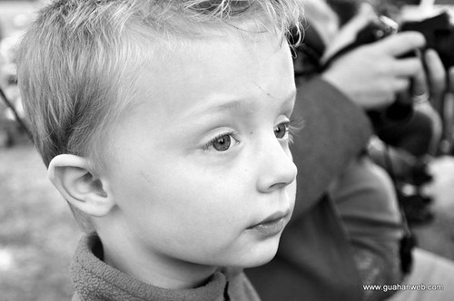
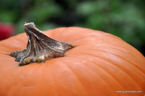
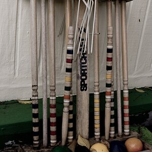
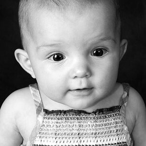
Hey, all. This is my first post that isn't just my introduction thread, and I would love to feedback and pointers on a few shots I've taken with my new D90. Here are a few shots I took on a trip to the pumpkin patch with our kids last month. Any feedback is greatly appreciated!

3153203525_f53859863e.jpg


3153266173_02b87ca21d.jpg


3153267765_676b4f0cd7.jpg


3153267701_57f77678bf.jpg


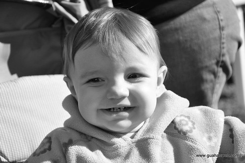
This last one is a bit dark, but I haven't done any retouching to it at all.

Please provide direction or ideas you may have!
 
try to get all of their heads in the pictures
I disagree. It's perfectly fine to exclude parts of their heads...especially when it makes their faces more prominent in the composition. That's my opinion anyway.
 
1) and 2) suffer from distracting backgrounds. Also, try to avoid placing your subject in the centre of the image. A lot of people make the mistake of not filling the frame with their subject, resulting in wasted space, but I think you went a little too far the other way. Getting close works in 4), but in 1) I'm not convinced by it: I feel like I'm either seeing too much or too little of the subject.
I like 3), but I'd try to clone out the red blur in the background. Also, you could have used a slightly smaller aperture, (higher f/ number) to get the whole of the pumpkin sharp, but still keep the background nicely out of focus.
4) is nice, but the background, again is distracting. Is there a person in the background? In this shot it's enough out of focus for it not to be annoying, but it would still be nice if it wasn't there.

You have very cute kids.
 
I disagree. It's perfectly fine to exclude parts of their heads...especially when it makes their faces more prominent in the composition. That's my opinion anyway.

i agree about the last one, but the first one just looks odd to me with the cutoff. the last one looks good though since its closer up and has that face to face to feel
 
i agree about the last one, but the first one just looks odd to me with the cutoff. the last one looks good though since its closer up and has that face to face to feel
I'll agree with that. Although I think the first one would be better if it were even closer...rather than farther away to include the whole head.
 
1) and 2) suffer from distracting backgrounds. Also, try to avoid placing your subject in the centre of the image. A lot of people make the mistake of not filling the frame with their subject, resulting in wasted space, but I think you went a little too far the other way. Getting close works in 4), but in 1) I'm not convinced by it: I feel like I'm either seeing too much or too little of the subject.
I like 3), but I'd try to clone out the red blur in the background. Also, you could have used a slightly smaller aperture, (higher f/ number) to get the whole of the pumpkin sharp, but still keep the background nicely out of focus.
4) is nice, but the background, again is distracting. Is there a person in the background? In this shot it's enough out of focus for it not to be annoying, but it would still be nice if it wasn't there.

You have very cute kids.
Thanks for the input on the backgrounds. I was so focused on the subject that I didn't even pay attention to what was in the background. In fact, the first picture was just a random shot that I really liked. I agree that I don't really like the boring old centered subjects shot after shot, but I may have to back off on the extreme I take, as you mentioned.

I definitely need to learn to balance the aperture better. That is proving to be one of my biggest challenges so far. Thanks for the tips!

Thanks for the kind words about my kids, too. I definitely think they're great ;)

I disagree. It's perfectly fine to exclude parts of their heads...especially when it makes their faces more prominent in the composition. That's my opinion anyway.
I agree with you both, actually. The first shot was a random one that I really liked, but I think the comment about the full head not being in the image is very accurate here. Because so much of his neck and torso are showing, it makes the feel of the crop a bit uneasy to me the more I really look at it.

However, I also like to play with different crops and proportions to creatively focus on different aspects of the photos. I agree with you both that the 4th picture is appropriately spaced without the whole head showing, though.

Thanks again. This is the kind of feedback that is invaluable.

Any suggestions on lighting techniques or actually planning for portrait style photos? All of these were just ones that turned out well from a "day out", but if I were to sit my kids down for a shoot, what are some pointers to setting up a good environment and getting acceptable pictures?
 
never thought about the first one closer, would be a good shot for it now that i picture it
 

Most reactions

New Topics

Back
Top