C&C - Fashion Shoot

MichaelHenson

No longer a newbie, moving up!
Joined
Nov 15, 2013
Messages
746
Reaction score
176
Location
St. Louis, MO
Can others edit my Photos
Photos OK to edit
So, I do a monthly model shoot for a local resale boutique. They send out an email getting entries and choose from the responses for the "Model of the Month" that they then use for emails, social media, etc. I don't get paid much for these so I use them as a classroom for myself, trying out lighting, working on posing, etc.

Anyway, this is the latest shoot (from last Thursday night) and I knew we were going to have prom dresses in the mix so I wanted to go for a fashion-esque/"glamoury" look.

I'd love some C&C! Thanks!

(BTW - Frequency separation and retouching is next on my "to learn" list...As such, I've kept my retouching efforts minimal.)
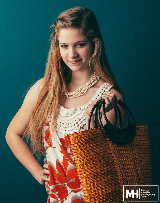
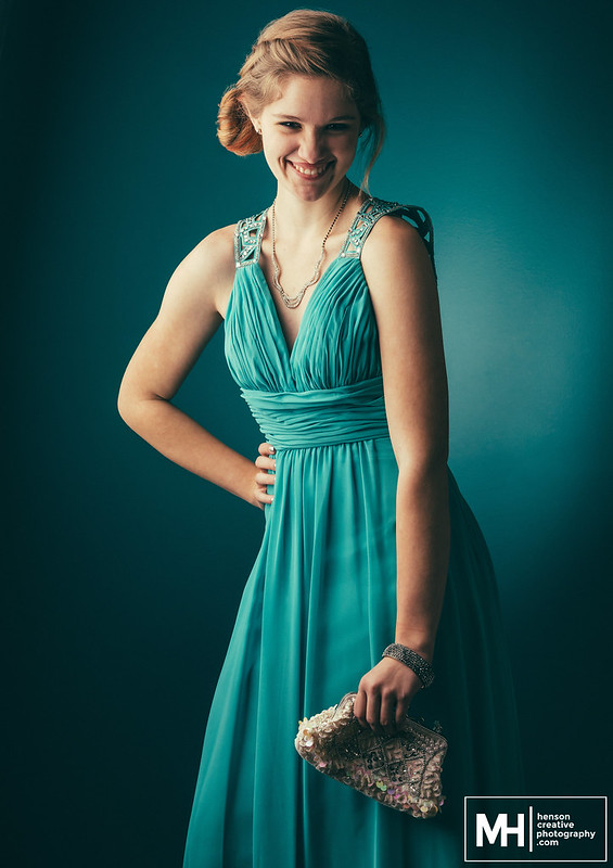
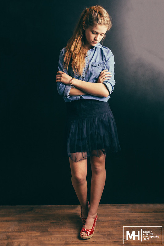
25454478516_3ccaf0c6c5_c.jpg
25113064109_dc06214f31_c.jpg
25362176432_1c0158de32_c.jpg


Full set here.
 
Excellent!
 
Nicely done; my only thought is that in #2, the direction she's looking seems a little 'odd'. Either to the camera as in #1, or off camera as in #3, but sort of 'half-way' of #2 doesn't really work IMO.
 
Thanks, tireiron!

In #2, she's looking at the camera but the shadowing helps along the illusion that she's looking "just off" camera. Might bring those shadows up a bit to fix that illusion. Thanks for the feedback!
 
In general I love the coloring, looks maybe like a lifted-black kind of thing?

In the first:
  • Love the lighting.
  • I might try a little frequency-separation on the right arm, there's a little bit of blotchiness maybe around the bicep.
  • Which product are we featuring? The bag? The top? The necklace? Or Yes? :)

In the second:
  • The models expression is warm, happy and genuine, her "character" seems very approachable.
  • The position of her right arm seems a little uncomfortable, maybe
  • I like the blowy gradient halo of light behind her
In the third
  • I like the way the line of her gaze and her hair form an apex at the top.

Thanks for the feedback!

Yes, I definitely need to get cracking on learning frequency separation. It's on my to-do list! We are featuring all the products. They are items from the boutique I was shooting at, so all the items were "featured" as an ensemble.
 
Hi! Since you're featuring the products (I'm guessing the bags are key) try to make sure the models are a. holding the bags on the side that is being lit and b. posing the bags in a way that brings attention to them. The girl holding the clutch by her thigh could better showcase the bag by holding it up near her collar bone (hard to describe without demonstrating.) Also, you should have some small clamps on hand so that you can clamp dresses to fit perfectly. The one model's dress is too big in the back, leaving a noticeable gap.
Overall, I may rethink the lighting. The girls are young and fresh looking and the products pretty and spring like. Don't get me wrong, I'm a fan of moody lighting, but I would probably opted for a more "high key" look on this shoot and white paper as a background. Also, this would help keep the focus on the products. Right now some of the products are falling into shadow.
The shots aren't bad, but you asked for some tips. There is some room for improvement.


Nailed it.

Exactly my thinking when reading the purpose of the shoot and viewing the images.

Love the images and if they were for the model then perfect but you've made HER the star of the show and not the merchandise. If you look at catalog images, the girls are pretty but pretty boring and it's the items that jump out.
 
Thanks all for your responses! I definitely agree with what you are saying regarding the model being the "star" and the product just "being there."

While this is a monthly shoot for a resale boutique, a big part of the appeal is the fact that they are choosing models from actual customers that shop there and using those photos and "models" to try to engage people on social media. So, the model is meant to be the focus.

Regarding the clamps to make the clothing fit - GREAT point. I didn't even notice that until just now. Definitely going to be looking at that going forward.
Regarding lighting - I get the part about possibly preferring high key...However, I did high key last month with a white seamless background and with the theme being "prom" I decided a more glamorous look might be appropriate. In hindsight, I probably should have brightened it a touch for the non-formal dresses.

Thanks a TON for responding and for the feedback!
 

Most reactions

Back
Top