
scooter2525
TPF Noob!
- Joined
- Jan 4, 2009
- Messages
- 60
- Reaction score
- 0
- Can others edit my Photos
- Photos OK to edit
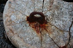
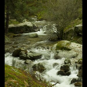
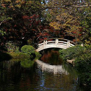
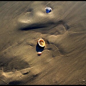
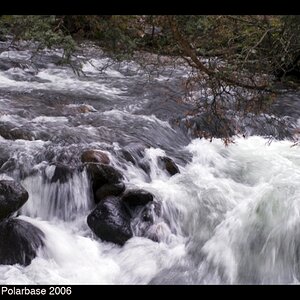
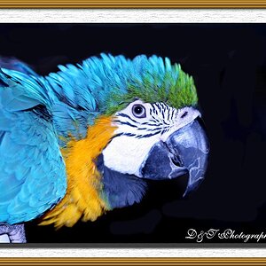
I'm not quite sure what C&C means, but I'm guessing it means comments and corrections. Anyways, have at it. My photoshop isn't working at the moment, so I'm not able to edit them, but I'll get it up and running soon.


")


![[No title]](/data/xfmg/thumbnail/39/39293-55a527d2a9b287bf5e5b6d118abab22c.jpg?1619738958)
![[No title]](/data/xfmg/thumbnail/33/33357-bd174890e33fb2a7f7338b9278e6dad2.jpg?1619735920)
![[No title]](/data/xfmg/thumbnail/33/33356-9cfc19255e84aab13c903f781a99cf9f.jpg?1619735920)