C&C Logo's Please

ajcstudio

TPF Noob!
Joined
Mar 25, 2009
Messages
39
Reaction score
0
Location
Baltimore MD
Website
www.lifeinstillimages.com
Can others edit my Photos
Photos NOT OK to edit
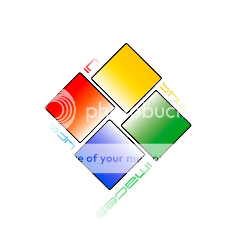
I made a couple of logo' and i will say i like 1 and 2 the best but me and my business partner are debating on one or the other.
1.
square.jpg

2.
green.jpg

3.
image2.jpg

4.
image3.jpg

5.
image5.jpg

6.
image6.jpg


So tell me what one is your favorite or what is wrong with the ones i have. Again I really like 1 and 2.
 
The only one I remotely like is #1... although the fade-out of the letters bugs me. You might also considering putting in an actual photograph somewhere... so that people know that you're a photographer.

In general, I think these logos are trying a bit too hard to be clever and/or artistic...
 
I understand that but i need a logo that i can use for letterheads and signs and such the business card is what i made when i didnt design a logo. Just like if you look at the picture people and all other studios they have logos and name as their signs up on the building not a picture. So i want a logo i can use on my work vans my letterheads and also my business cards.
 
My personal opinion is that I like #3 and #5....not sure if I like the "people" in #3, but I like the composition and then #5 I really like although it might be dated....but that is just as my personal opinion....not sure it helped at all....
 
I don't have a favorite. I would not consider any of these for my companies identity branding. They are generic, plain and offer no indication as to what your profession is. If your happy though, that's all that matters. I am offering a constructive personal opinion.
Secondly, not every photographer has a logo.
 
#1 is too reminiscent of windows. being a mac man, that gives me the creeps. number two is much nicer.

Also number two will still look like itself when photocopied. Number one wont, because the 4 colors will disappear.
 
Yeah I dont like any, none of them are really strong enough to stand on their own. The first one is strange because the letters fade and they way they are positioned, its hard to read. The second one, though I like the use of the bright color to grab attention, doesnt look like a photography kind of logo to me...it reminds me of a racing related logo or something. The same can be said with the third, it reminds me of an exercise place or something. The fourth theres not much to say other than I dont like the vertical text and I'm not sure what the "grass" is supposed to represent. I'm also not sure about the "birds" in the fifth. The last one is just basic text, which can be done well if you utilize typography, different font weights, etc. However it just looks a little basic and boring. The drop shadow really isn't doing anything for it, in fact it may not be a good idea to use the offset drop shadow because there may be instances when you want to print your logo on something and are unable to use the drop shadow.
 
Well, number 4 is your best bet, but not in green. I'd probably go black or white... If you were to add it to your business card, choose white.

The others all have issues im afraid.

The first doesn't read very well, partly because of the text positioning and also because of the grad fade. This will not print well in certain situations.

You mentioned van graphics... then you would be better off without using fades or drop shadows as you would really need a vector graphic and not a bitmap image. Although you can still use bitmap images to some extent.

If you really want to look pro id suggest a pro designer (as i would say as i am one:p.. but it can make a huge difference to first impressions) if your going to go it alone, have a good look through google and other logo sites and try and get some inspiration to how you can communicate your business in the most effective way.
 
I am going to redo the font in the first one to make it more legible and maybe even position it different and i like #2 because it is basic and easy to read but has some taste. If I had the money for a pro designer than i would of deff got one to design a logo. But since im a broke man i am tryin to sdesign one myself and i think for a total noob i am not terrible i mean looking at places like walmart, target, other big name companies my logo isnt too bad. i mean even giant's new logo is all colorful.(though it looks retarted)
 
Your logos have really nothing to do with photography. I wouldn't know that's what you do by looking at any of those and that really is the point of a logo. You really shouldn't compare yourself to Target or Walmart because it's aples and oranges. Targets logo gets the job done, thats what it is, a target. By the tone of your last reply it seems you're not really open to the CC that's been offered and are just going to use one of these anyway(I wouldn't use any if it was my buisness). So why even post them? Good luck to you. I do like the image you used on your buisness card! Is it one of yours?
 
Why do you need a logo? What advantage will one of the above logo's give you over a concurrent? In my opinion it's better to have no logo at all, then using a logo just because "every" studio has one. If your business grows and you start making decent revenue, you can still decide to hire a pro-prodesigner for a logo.
 
Why do you need a logo? What advantage will one of the above logo's give you over a concurrent? In my opinion it's better to have no logo at all, then using a logo just because "every" studio has one. If your business grows and you start making decent revenue, you can still decide to hire a pro-prodesigner for a logo.

A good point. When you're just starting out, you should be spending your time marketing your business... not tinkering with logos.

Jim
 
I wouldn't use any of these, they all look like bad corporate logos of some kind. A logo doesn't need graphics, it can be just type. I would try playing with different fonts. Maybe research what other photographers have as logos and go from there.
 

Most reactions

New Topics

Back
Top