C&C Please?

Nolan

TPF Noob!
Joined
Jun 2, 2009
Messages
246
Reaction score
0
Location
Toronto
Can others edit my Photos
Photos NOT OK to edit
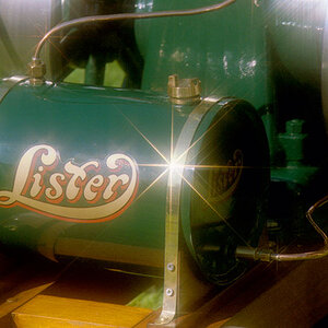
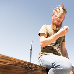
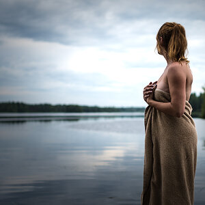
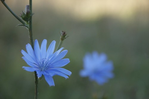
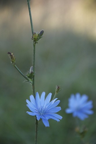
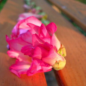
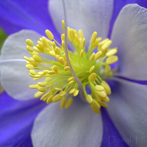
I ventured down in to a vast valley near my home with hope of refining my photography skills tonight and I think i may have been successful. Heres a tidbit of what I captured. C&C is greatly appreciated, thanks!

1)
3932938382_573ea62824.jpg

2)
3932176141_6dd11ee782.jpg

3)
3932959654_29077e62b4.jpg

4)
3932963072_0f5cf6c2cb.jpg
 
I like it. Im a beginning photographer, so I can't give any real advice...but I like the photos! Keep it up.
 
I like the first best, and simply because the background is the least distracting. It's easy to concentrate on the in-focus flower.
 
Thanks for the input. Its nice to hear from you all.
 
I like numbers one and four the most, with a very strong preference for the fourth photo, which I think has a really nice,differentiating element, and that is the vertical composition that emphasizes the height, or the climbing nature of the plant stem. The subject matter is a tall subject,and so the composition matching it makes the most sense, and uses the space the best.

In the fourth photo, I like the way we can see not just one future bloom, and not just two future blooms, but four future blooms, plus the two that have already opened. In the fourth photo, although it is small, it appears like there's some slight backlighting that reveals the shape and the slightly hairy
covering on the future blooms better than in the first three photos.

To me, shot four is the one that best shows off the plant,and the one that best uses the second blue flower as an out of focus background element.
 
Nice work with shallow DOF..
 
I like the first best, and simply because the background is the least distracting. It's easy to concentrate on the in-focus flower.

Denny i love your username and coinciding avatar!! excellent!!!

as for the OPs shoots! yes very nice....im a noob too so my oppinion doesnt carry much weight but i like these!!
 
Numbers 1 and 4 are the best. (I really like number 1). The flowers in 2 and 3 seem to have the flowers too close. It looks like they sorta blend in since they are the same color.

Great photos! Keep them coming!!
 
Not bad. Perhaps the next time you might consider an aluminum or what reflector card or a bit of fill flash to give it a bit more contrast.
 

Most reactions

New Topics

Back
Top