Nolan
TPF Noob!
- Joined
- Jun 2, 2009
- Messages
- 246
- Reaction score
- 0
- Location
- Toronto
- Can others edit my Photos
- Photos NOT OK to edit
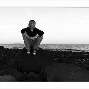
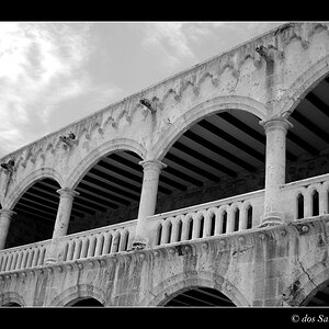
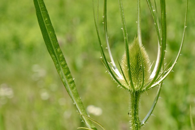
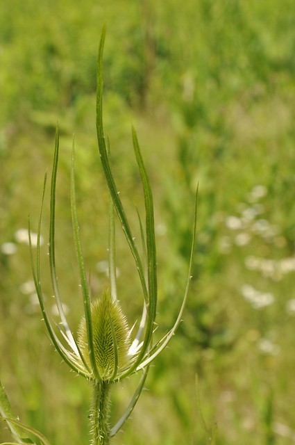
Took these shots today in a local ravine while enjoying Canada Day. Tell me what you think, I am open to all constructive comments and critiques.
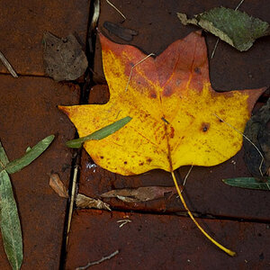
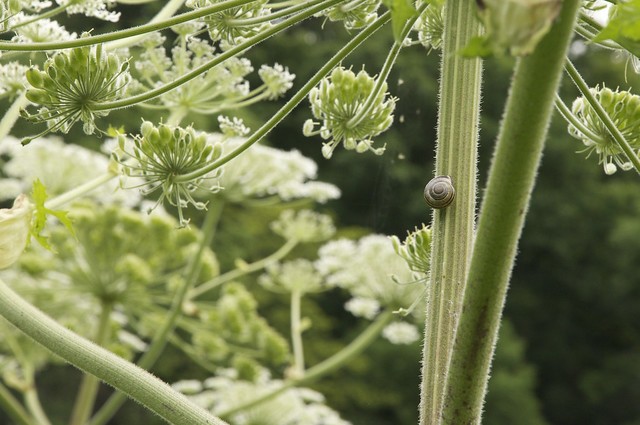
1)
Camera NIKON CORPORATION NIKON D90
Exposure 0.004 sec (1/250)
Aperture f/18.0
Focal Length 92 mm
ISO Speed 450
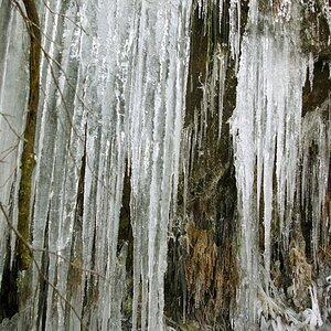
2)
Camera NIKON CORPORATION NIKON D90
Exposure 0.004 sec (1/250)
Aperture f/18.0
Focal Length 75 mm
Focal Length 75.5 mm
ISO Speed 400
3)
Camera NIKON CORPORATION NIKON D90
Exposure 0.004 sec (1/250)
Aperture f/18.0
Focal Length 105 mm
ISO Speed 800
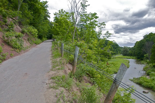
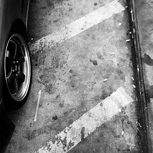
4)
Camera NIKON CORPORATION NIKON D90
Exposure 0.002 sec (1/500)
Aperture f/11.0
Focal Length 18 mm
ISO Speed 800
1)
Camera NIKON CORPORATION NIKON D90
Exposure 0.004 sec (1/250)
Aperture f/18.0
Focal Length 92 mm
ISO Speed 450
2)
Camera NIKON CORPORATION NIKON D90
Exposure 0.004 sec (1/250)
Aperture f/18.0
Focal Length 75 mm
Focal Length 75.5 mm
ISO Speed 400
3)
Camera NIKON CORPORATION NIKON D90
Exposure 0.004 sec (1/250)
Aperture f/18.0
Focal Length 105 mm
ISO Speed 800
4)
Camera NIKON CORPORATION NIKON D90
Exposure 0.002 sec (1/500)
Aperture f/11.0
Focal Length 18 mm
ISO Speed 800
")