matt62485
TPF Noob!
- Joined
- Mar 20, 2009
- Messages
- 553
- Reaction score
- 7
- Location
- Wilmington, NC
- Can others edit my Photos
- Photos OK to edit
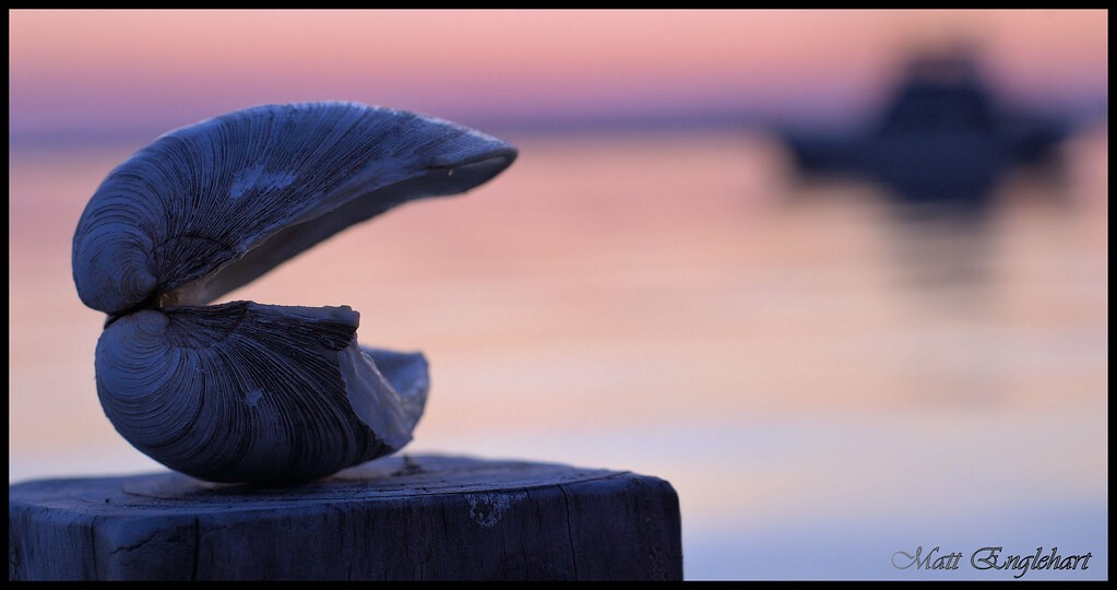
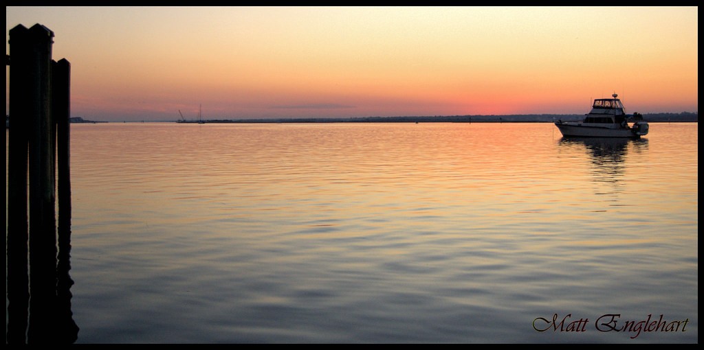
Please give me input here. Don't laugh at me! its only my second time actually attempting to shoot a sunset. I feel better about this set than my previous one but still not 100% satisfied.
I was on a floating dock. yes, I know, but it's the best position I could get to before the sun went down.
Please C&C!
1.

2.
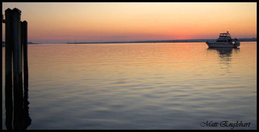
3.
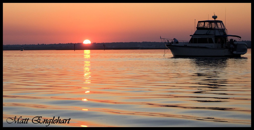
4.
5.

I was on a floating dock. yes, I know, but it's the best position I could get to before the sun went down.
Please C&C!
1.
2.
3.
4.
5.


![[No title]](/data/xfmg/thumbnail/37/37929-d9f744e40945eb18b68bb10eb79dbbbc.jpg?1619738401)