C&C Welcomed and appreciated!

mpasq66

TPF Noob!
Joined
May 12, 2009
Messages
144
Reaction score
22
Location
Pittsburgh
Can others edit my Photos
Photos OK to edit
3552935133_fba066c5ac.jpg


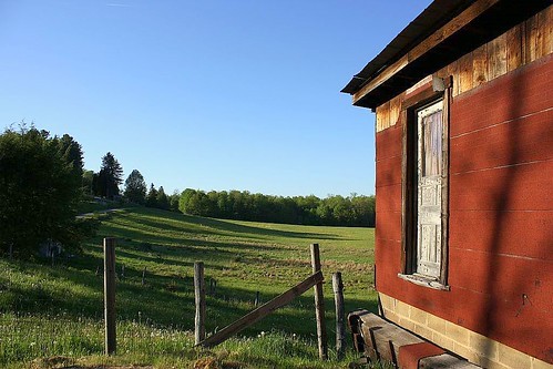
Model - Canon EOS DIGITAL REBEL XS
Software - Picasa 3.0
ExposureTime - 1/13 seconds
FNumber - 32
ExposureProgram - Manual control
ISOSpeedRatings - 100
ShutterSpeedValue - 1/12 seconds
ApertureValue - F 32.00
ExposureBiasValue - 0
MeteringMode - Multi-segment
Flash - Not fired, compulsory flash mode
FocalLength - 42 mm
ExposureMode - Manual
WhiteBalance - Auto
SceneCaptureType - Standard
Self timer - 20/10 sec
Quality - Fine
Flash mode - Not fired
Sequence mode - Single or Timer
Focus mode - One-Shot
Image size - Large
Easy shooting mode - Manual
Contrast - Normal
Saturation - Normal
ISO Value - 32767 (other)
Metering mode - Evaluative
Focus type - Auto
Exposure mode - Manual
Focal length - 18 - 55 mm (1 mm)
White Balance - Auto
Sequence number - 0
Flash bias - 0.00 EV
 
Last edited:
The first impression I get out of this one is: flat.
And: the composition is so that it divides the photo into two exact halves, which is never quite that good. Too balanced - you'd much rather want some dis-balance which increases "tension" in the viewer (it just happens, has been a fact for centuries, and has been described by visual artists for as long as that). I think if you had taken two steps to your right, getting yourself closer to that wall of the house, using that as the leading line into the landscape beyond, you'd have done better.
 
I see what you're saying, thanks!!
 
Something in the way of these?:

3555176967_b415e0bb20.jpg


3556017078_521029cb24.jpg


I know there's not alot of excitement here, I'm still an ultra newb, so I was just playing with exp./f-stop/ iso, just feeling my way. Just loved the color, especially as it got later in the day. Basically I hope the quality will come, I'm just trying to figure out if what I think might make a good "photo", someone else does also... if that makes sense...?
 
Yes, to my mind, both the newly posted ones are better than the first. The light helped you "sculpture" the landscape some more and the two new ones make use of the long shadows provided by the trees on the left, of which we only see parts in the very first (the originally posted) photo. I now think the last is my favourite out of these, in all respects: composition, but also exposure, saturation etc. You WANT a larger part of red house in the photos, and that part is too small in the middle photo. In the last, however, it is still over on the righthand side, more room, though, is given to the view as such, and red of house and blue of sky (really best exposed for here!) look very good together.
 

Most reactions

Back
Top