camera shy

JohnMF

No longer a newbie, moving up!
Joined
Mar 25, 2005
Messages
3,009
Reaction score
11
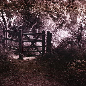
not a very willing subject, determined to ruin my shot :er:

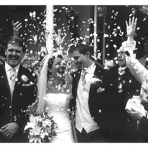
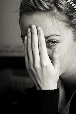
still something about the photo i like though

do you think a different crop could do anything to improve the picture? I was thinking maybe a square one, closer up, but im not sure

Also some areas look borderline blown-out on my monitor, have i got away with it?

any other comments/critiques welcome

jayne2c.jpg


BTW ok to edit

thanks
 
The photo is in focus where it has to be (her eye!) - and do I detect a teensy-weensy bit of selective colouring? Great!
The way this came out, I don't mind her "ruining" your pic, at all, though someone should tell her once and for all that there is NO NEED TO HIDE!!! She is very pretty, I think I can tell that, even from what little I can see! Tell her I said so! And she should get as many photos taken while she is still this young and without wrinkles... (ask me :roll: ).

I would not crop this any differently, and I don't detect any hot spots.
I very, very much like the focus on this one eye she's giving us... can't get over that, and the tiny splash of colour. :D
 
This is excellent, not one thing wrong with it in my eyes.

*edit* actually the white stuff in the background next to her sleeve is a bit irritating, i would clone it out.
 
Beautiful light, beautiful vignetting; awesome portrait!!
 
There's a lot to like about this shot. And no, you didn't blow anything out. The bright areas didn't go completely white, so there's data there and you have gradiation in the bright tone. I really like it.

The only thing that stands out to be is having the hand/eye so close to the center of the image. Here's my interpretation of a crop.

jayne2c-mod1.jpg


Or you could get in real close and really present the hand, but you end up losing a lot of what I like about the original. I think that would be a good additional shot if you were doing a series.
 
I should note that, yes, the hand and eye are still close to the center, but with the crop, the eye now is a lot closer to the upper right "hot spot". It just feels more balanced and pleasing to me.
 
Great shot ! I also like the cropped version that mark did. Tone or tint fits well in this image. Very nice focus of her beautiful eyes.
 
thanks for all your comments. i appreciate it

ffureel - i did start to burn the white bit out, but i got a bit side tracked with another area of the photo and forgot to come back to it. It is a bit distracting so i will get rid.

markc - it's exactly what i was thinking, about the hand and eye being too central. The original has abit more space around the edges, as this is already cropped in abit, so it should give me a little more room to play around with.

LaFoto - Yes, tiny bit of colour in the eye. And i will be sure to pass on your words of wisdom :)
 
JohnMF said:
...still something about the photo i like

Oh, yeah. There's something really nice goin' on here.

I don't know if you need to do anything to this image, but it's my nature to try (not an endearing attribute, I assure you). The hand is SO dominant, I tried a bit of burning in an effort to shift attention away, and a bit of rotation to take the bite off of all those vertical lines of the fingers.

Again, I'm not sure I'd change a thing though. A very compelling image.

Pete
 

Attachments

  • $jayne4c.jpg
    $jayne4c.jpg
    43.1 KB · Views: 98
oooh, I really like Pete's version.
You can tell she is a beautiful girl, but I remember never wanting to have my picture taken at that age either:)
 

Most reactions

Back
Top