Can you help me replicate this photography aesthetic

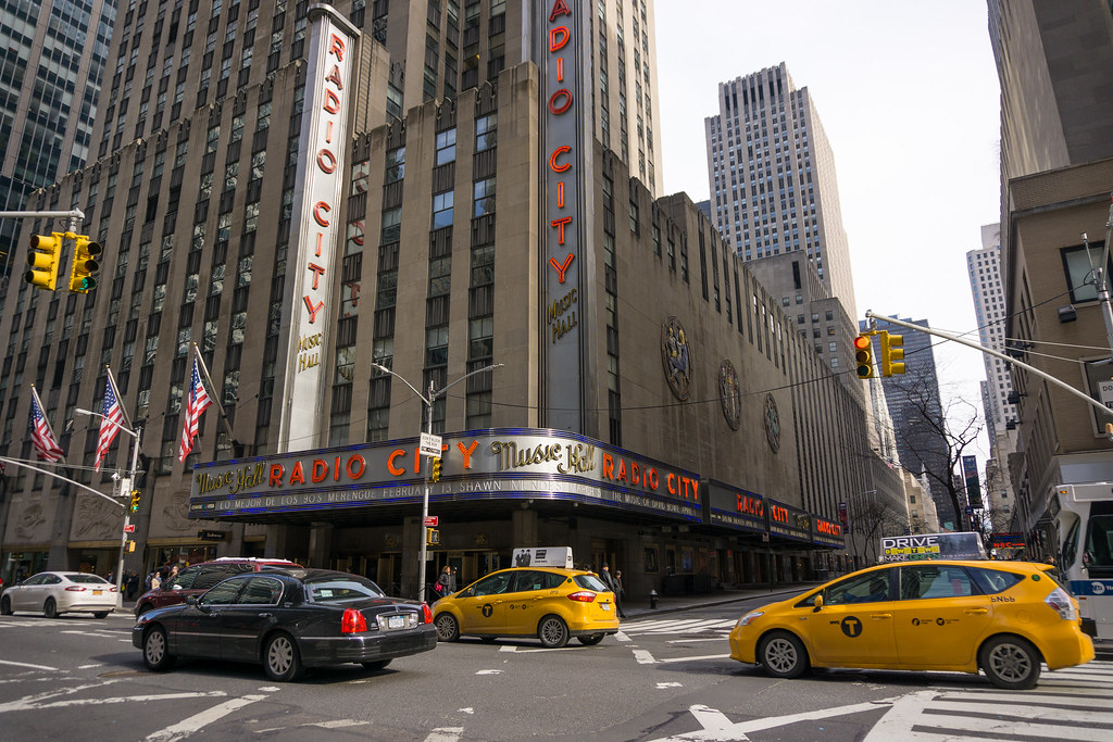
This seriously took me about 2min in LR:

upload_2016-9-10_13-34-54.png


Not the same lighting conditions, but a similar shot in NYC to this:

Instagram photo by Lex / Mr. Gumbatron ☕ • Sep 5, 2016 at 1:14am UTC


first thing I did was completely desaturate the yellows to -100.
then slide the red hue to +50 (look at the red stoplight in his image)
I moved point curve to "Strong Contrast"
Increased Contrast to +15
I bumped the clarity to +40
Increased the exposure by +1EV
then added in shadows to +90 since my original image was dark.

I'd say It's pretty close.
 
This seriously took me about 2min in LR:

View attachment 127337

Not the same lighting conditions, but a similar shot in NYC to this:

Instagram photo by Lex / Mr. Gumbatron ☕ • Sep 5, 2016 at 1:14am UTC


first thing I did was completely desaturate the yellows to -100.
then slide the red hue to +50 (look at the red stoplight in his image)
I moved point curve to "Strong Contrast"
Increased Contrast to +15
I bumped the clarity to +40
Increased the exposure by +1EV
then added in shadows to +90 since my original image was dark.

I'd say It's pretty close.

It almost kind of mimics a cold winter day. I already feel cold looking at it. Haha.
 
it was actually snowing in my pic, but you can click the link and see what I was trying to match.
 
This seriously took me about 2min in LR:

I'd say It's pretty close.

I'd say it was a lot easier than that. Check out the trees and shadows in your linked image, they're blocked or compressed. There is plenty of saturation in the colours as well but just in a narrow band (including yellow), check the clothes of the pedestrians. The mids and highlights are pushed towards white.

ex-1.jpg
 
I disagree. You're tell me there's plenty of saturation in this shot or this shot?

Look how bright the H&M sign is now. Look at the first image I linked, look at the red-lights -- they are a muted yellow.

Look how pale the taxi cabs, umbrellas, sky looks in the first shot I linked in this post. Look how nasty the skin tones look in the second shot linked here.

This is not a simply curves adjustment.


here's another of one of my random street shots:

24899759846_c8f964ea81_b.jpg


Let's just add your curve:

upload_2016-9-12_7-53-33.png


It looks NOTHING like what this guy is doing to his shots. It's may be a good place to start (like I said I adjusted the curves in a similar manner) but there's a lot more to it.
 
Last edited:
LOL, we having a discussion about how to create an instagram filter. :(
I see your point, there is more going on especially in the last you linked to.

What you just did is not what I did. I did the curves in photoshop, not in raw or lightroom, and if you adjust the luminosity channel only and not push the colour contrast the way lightroom does, (helps having an image in the same light), you get this, which is not a million miles away, especially when you clip the black point some.

ex-2.jpg


If you really want to mess up the colours then split toning is usually popular ;):

ex-3.jpg
 
ah yes, that's looking closer.

but yeah, im loling here too :p
 
When did they move the yellow light to the top?
 
When did they move the yellow light to the top?

It was first invented in Greece at around 1965 where right of way is decided by being first there, and expanded to other european counties, (except England who like queuing). It crossed the pond to the USA in around 1981, "the light was yellow officer...."
 

Most reactions

Back
Top