
Tight Knot
No longer a newbie, moving up!
- Joined
- Nov 30, 2010
- Messages
- 1,398
- Reaction score
- 159
- Location
- Boca Raton, FL
- Website
- www.lensphotoworld.com
- Can others edit my Photos
- Photos OK to edit
Hi all,
Here are a few versions of the same image.
I would love to hear which you prefer, and why.
Thanks all.
Here are a few versions of the same image.
I would love to hear which you prefer, and why.
Thanks all.
Attachments
-
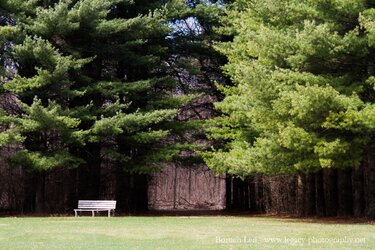 Wooden Bench next to trees with path through trees.jpg420.5 KB · Views: 125
 -
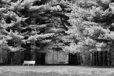
 Wooden Bench next to trees with path through trees - Full Contrast darker leaves BW.jpg513.9 KB · Views: 112
 -
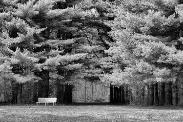 Wooden Bench next to trees with path through trees - Full Contrast lighter leaves BW.jpg514.8 KB · Views: 113
 -
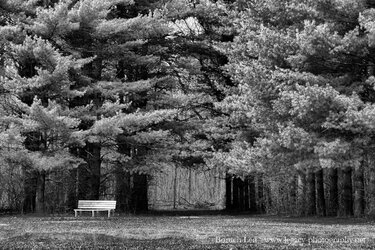
 Wooden Bench next to trees with path through trees - Harsh BW.jpg461.5 KB · Views: 122
")
 .
.
 Wooden Bench next to trees with path through trees
![[No title]](/data/xfmg/thumbnail/35/35875-613296cbb015a9d4bc5b47aca161290e.jpg?1619737200)
![[No title]](/data/xfmg/thumbnail/36/36680-2f2b1d32244516c9d5cf39af9b78b382.jpg?1619737677)
![[No title]](/data/xfmg/thumbnail/42/42276-99df5da06c3e5dc83ae4bab11e935910.jpg?1619740085)

![[No title]](/data/xfmg/thumbnail/37/37626-4a6ffc3f17ab3a8e97170fda3276640e.jpg?1619738154)

![[No title]](/data/xfmg/thumbnail/42/42278-22ed940cbdc5888a28d9be36006594dc.jpg?1619740086)