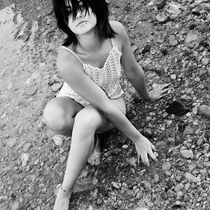
I have been working on my off camera flash skills. Here is Cara for some harsh C&C. Please give your honest opinions - I can take it and it helps me learn.
i agree w/ Sebastian,
#1 is blown to the left, as well as on her arms and face.
#2: I'm looking more at the awesome sky than her. Her eyebrows bother me and her facial expression is whatever.
#3: Lol, look at her left wrist & down, the angle makes it look like it's a stubby little doll hand thing. She looks pretty red, too.
I agree that #1 is a little blown out on the left side but I acctually think I like it better in this pic than if it had even lighting across the pic.
#2 the sky is awesome. I didn't even notice the girl at first.
#3 ...well....she's a hot girl in a bikini. Thats hard to mess up.
The bikini shot is flawed IMO. The legs seems severly amputated, the refraction on the left hand looks very odd and unfortunately, she suffers from the same disease as I do. A severe case of the gone-ass.
The other two are nicely done. If I had to nit.... the main light could have been feathered more on #2 so as not to be so extreme on the top of her head and left arm. But the background exposure is spot on. :thumbsup:
Her shoes dont fit her in the 2nd shot at all. I mean her toes are all hanging over the edge. I like the lines and lighting in two but her expression ruins it for me. Bland. Her expression in one at last shows a bit of emotion although the lighting in two is better. Number three does nothing for me because of her facial expression. Plus she has tan lines showing and she's red.


 google will break your heart

![[No title]](/data/xfmg/thumbnail/31/31755-9bffabfa76f6307bcd78f535b2421cb5.jpg?1619734993)
![[No title]](/data/xfmg/thumbnail/37/37491-9a5a4b87cc7adab94e5cc59f2da93701.jpg?1619738112)


![[No title]](/data/xfmg/thumbnail/31/31752-fcbc5aa4a94154b9c273592aa37b8b1e.jpg?1619734991)