Casual Portrait (Very slightly NSFW-ish)

Frankinfuji

TPF Noob!
Joined
Apr 7, 2017
Messages
73
Reaction score
48
Can others edit my Photos
Photos NOT OK to edit
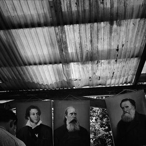
Just a quick natural light portrait taken while travelling with just the Fuji XF 18-55 kit lens. I'm hugely impressed by the professionally lit and retouched images I see on here, although for me, my portraits are more like frozen memories.

I only do minimal post processing, usually just to remove background distractions that I didn't notice when I took the shot, as these conflict with my recollection of the moment in time.

2017_0415_14215900_20170423194854924.jpg
 
Seems okay but doesn't feel like a portrait in the traditional sense.
 
Seems okay but doesn't feel like a portrait in the traditional sense.

Just my particular taste I guess, but for me the perfectly posed, professionally lit and retouched portrait is just one genre of portrait photography. On another forum, all the critique is based on a very nartow set of rules dictating what a portrait must look like, and anything else is judged as wrong.

I think portraits can also be more natural, and hopefully capture some unique character?

2017-04-23_09-59-41.jpg
 
I want to see it in B&W with a bit of darkening and selective burning.

Yeah, that could be very nice, a B&W with some dodge and burn performed on it. As-shown in color, I think the edges of the bed sheets are too bright, and tat a very slight vignette, or some edge-burning, would help to cntain the image borders, and would reinforce her sideways line of gaze. It's a small operation, an edge-burn, but I think it;'s wortht he time to take a 200-400 pixel wide, soft-edged brush and burn down the outside edges on light-toned things like this, to maybe a Minus .3 EV level, keeping it subtle, yet visible.

On my iMac, both of these images appear rather light in the background tone values, and I think both would look better if the outside endges of the images were darkened a bit. But of course, this is just personal opinion, and I DO LIKE like, airy, ethereal images of women...sort of that bright, gauzy look that has always had a following. I myself DO like a bright image quite often, and I respect your artistic vision.
 
Last edited:
My post processing skills and software are very limited, but is this the type of look you mean?

2017_0415_14215900_20170423194854924_20170423233254491.jpg
 
Oh, wow, now that is simply a lovely,lovely sepia-tone rendering! Very classic!
 
Yes, you're getting there. I like this so much more than the color. On my tablet, I want it darker. The red tones are nice. You have some slight shadows on the face, darkening the image would bring out the changes in light and add a bit more 'mood' into the photo.
 
Yes, I did not see Gary's comment, but I did give it an "Agree"--a slight bit more darkening would also be a good rendering of the sepia-tone shot. Truth be told: I will often take a nice shot like this one, and do four or five different Lightroom "looks", each one a bit different, or a lot different,and will not decide on a final "look" for at least a week or more. I think it's important to explore an image, and see what it might possibly be, by developping it in software in more than just one manner.

What Gary is saying in a way, is that this image might render better in another "key"; the light itself could be represented in another way, perhaps more dark, so that the shadows and the light-play come through, each more revealed, the shadows and the highlights, by darkening the image a bit.
 
2017_0415_14215900_20170423194854924_201704232332544912002.JPG


I went this dark, which is about where I envision the way the lighting might have been, but I can see some posterizing (at least I think that's what it is) on the sheets in the lower, right corner of the image, due to working with a small, size-reduced file. I think the sepai-toning looks more feminine and delicate and timeless than a full-RGB color rendering of this subject.
 
Derrel said:
View attachment 138637

I went this dark, which is about where I envision the way the lighting might have been, but I can see some posterizing (at least I think that's what it is) on the sheets in the lower, right corner of the image, due to working with a small, size-reduced file. I think the sepai-toning looks more feminine and delicate and timeless than a full-RGB color rendering of this subject.

Yes, I see - gives a timeless, vintage look.

The small, compressed file must be causing the postertised gradients.

2017-04-22_01-31-24
 
View attachment 138637

I went this dark, which is about where I envision the way the lighting might have been, but I can see some posterizing (at least I think that's what it is) on the sheets in the lower, right corner of the image, due to working with a small, size-reduced file. I think the sepai-toning looks more feminine and delicate and timeless than a full-RGB color rendering of this subject.
That's lovely. Classy finish.

Sent from my VS990 using Tapatalk
 

Most reactions

New Topics

Back
Top