ruggedshutter
No longer a newbie, moving up!
- Joined
- Mar 22, 2012
- Messages
- 146
- Reaction score
- 33
- Location
- North Carolina, United States
- Website
- www.ruggedshutterphotography.com
- Can others edit my Photos
- Photos OK to edit
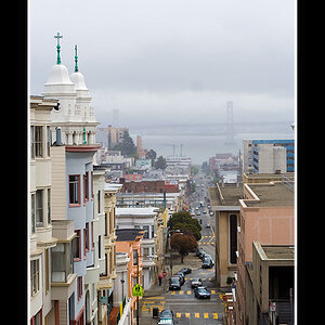
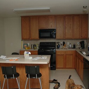
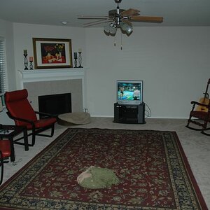
Just looking for an overall critique for my website. Is my message clear, clean and simple? I tried to keep the site simple. You can critique the photos if you want but it's not necessary.
www.ruggedshutterphotography.com
www.ruggedshutterphotography.com
Last edited:


![[No title]](/data/xfmg/thumbnail/40/40306-ea393f71adcd88a9abb9fb16dc6af2d5.jpg?1619739413)
![[No title]](/data/xfmg/thumbnail/34/34124-fcd12598382b4477643ef3dde2d6751d.jpg?1619736294)

![[No title]](/data/xfmg/thumbnail/39/39498-362f11d9bfd0d9e222faa85b38801745.jpg?1619739056)
![[No title]](/data/xfmg/thumbnail/31/31038-84f0b9d14b7ced20e61bc19a9d4dfcc2.jpg?1619734581)

![[No title]](/data/xfmg/thumbnail/42/42058-8597ac0f687fb4007aa3ca0210936f04.jpg?1619739994)