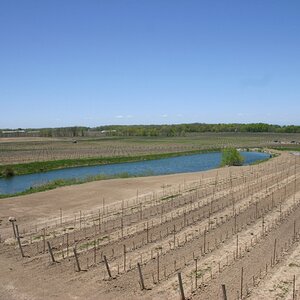
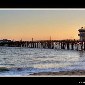
I quite like this one; it has almost an 'Abbey Road' feel to it with the zebra crossing in the foreground. The skating rink isn't bad; maybe a touch too contrasty?
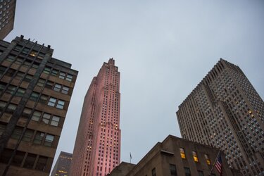
TiredIron, he said he would keep posting until you were happy...so keep quiet...) I like NY scenes
Ok, I agree, the blue color is too much.
I really like the angles of 2 and 4! Can you re- work them more naturally?
I am newer here, so can't tell you how to adjust, but I like the views...
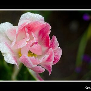
What are you using to process the pictures. Almost all of them are over saturated. If you're using Photomatix, don't go over more then 70 in saturation (even that might be too high). Even though I hate the presets, I still like to start off with the Neutral/Balanced to give me a good starting point.
I think what you are doing is tone mapping, and not true HDR. The rink one was better, and the black and white, but most of the color ones are going way over board.
1 image taken, then make 2 copies, so you have 3 total images. Take 1 image to -2 exposure, one image straight out of camera, and 1 image plus 2 exposure.


")
![[No title]](/data/xfmg/thumbnail/42/42025-fa343f816d0cedc45447aa0b300e301e.jpg?1619739982)
![[No title]](/data/xfmg/thumbnail/41/41423-156eb6e5a056cd1cbcf60e12a03f9d56.jpg?1619739809)

![[No title]](/data/xfmg/thumbnail/42/42021-ffc326f5dc5b4c65ce53935e6e9e4338.jpg?1619739980)