Chado "The Way of Tea" C&C (BESP)

K.Li

TPF Noob!
Joined
Dec 23, 2009
Messages
83
Reaction score
0
Location
Australia
Can others edit my Photos
Photos OK to edit
Aim:

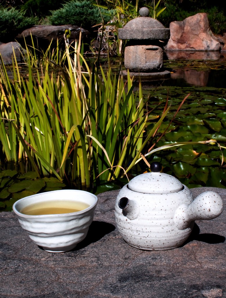
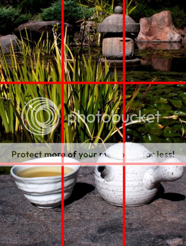
Our very first assignment is to high light the important of the rule of third as well as a background that contributes to the image. We were also asked to provide interest in three out of four "thirds". Lastly, our subject needs to be a beverage and the final result should be appealing and make our viewer wants to drink it.

My interpretation of the assignment first came to mind when I was reminded that there is a little Japanese style garden where I live called Himeji Garden. I then found a tea pot and cup to bring to the garden along with hot water and all my equipments.

I am trying to bring out a relaxation feel while bringing the focus onto the tea pot and tea cup. The background was kept mostly in focus to show the features of the garden. And I didn't want to just use shallow DOF to blur background like always.


Setting:

Camera: Nikon D90
Lens: 35mm F1.8G
Focal Length 35mm
Aperture: F/22
Shutter 1/100s
ISO: 100
Lighting: Natural light, bright day light no shade


Image:

4405358930_afa0b2f143_b.jpg


Conclusion:

There are a few things I would personally change for this image, firstly a softer light during later time of the day would be much better. Also I would think that the composition would be better if the tea pot was slightly closer to the tea cup with a little overlap. Other than those two I am pretty happy with the photo.

Please feel free to comment on the image, all C&C are welcomed. If there are any questions regarding the set up for this image, let me know and I will be happy to answer.
 
Nice.

My biggest complaint, like you already stated, is the harsh light. If the light were softer, I would love to sit there and drink a few cups of genmaicha.

I like how the stone sculpture mimics the forms of the cup and teapot.
I like the irregular line of the stone "bench" the cup and saucer are sitting on.

Another distraction for me, or at least I see it as a misplaced element, are the vertical leaves of the water iris, or sweet flag. Vertical lines suggest strength, power, and growth. In this scene I would try to show more horizontal lines which are calming, soothing, and meditative.

As I look at it more, I keep going back to the iris leaves. I wonder how this would look, in landscape orientation, from a lower perspective, which would bring the stone sculpture closer to the tea, and it would move the cup up into the leaves, obscuring them somewhat.

I think you did a nice job thinking about your beverage and putting it in an appropriate setting.
 
My personal opinion....I would have probably tried to get less of the leaves in the shot.
As for the drink itself...it doesn't look like something i would want to drink...but maybe that's just because i wont drink anything brown.
But i do like the rest of the details. I think you made it all work nicely together.
Even though i know the main subject is the drink....I really really like the reflection of the rock caught in the background. It definitely draws just enough of my attention up from the drink to really see the rest of the image.
 
I think the elements used for this photo are unique which will make this composition different than the others. I like that. We won't find the cup, teapod and stone sculpture used here in any other photo. This is really original.

I wish the long leaves behind the cup weren't there; they are distractive and some how take most of the attention. I am glad you used most of the spaces in the photo as Bitter requested.

If relaxation was your purpose, you achieved it. Congrats.
 
Thanks for the comments! I agree with all the things mentioned, I did try a few different angle but I was limited to this rock because its the only one I can position myself and the tripod without falling into the lake lol.

I will keep them in mind and hopefully show improvement in the next assignment!

This whole thing is great fun! And it motivates me alot more then usual to think of original ideas and plan ahead before the shot. Comparing to usual "snapshots"
 
This is a very instructive scene, on many levels. The beverage inside the cup would be hard to show if the camera's point of view were much lower. The camera-to-subject distance in this case is dictated by the size of the main subjects, the teapot and cup, and the lens focal length you have on the camera; if you had photographed this from double the distance, with a 70mm lens, the angle of view behind the tea cup and tea pot would have been significantly narrower. The angle of view would have eliminated the large red rock and the stone sculpture that comes out of the water in the upper right hand corner area. If yuo had shot this from even farther back, the background angle of view, with the same camera height, would have narrowed the composition down to just the teapot, cup and its contents, and the iris leaves.

This photo shows how critical the lens and its focal length, and its angle of view are, and demonstrates how true perspective is determined by camera-to-subject distance. What the 35mm lens is giving you is a "scene", with a foreground and a background that has multiple elements. In this particular scene, the objects are shown in relation to their background, and we get an overall view, which emphasizes the tea cup, the stone base,and the teapot. When working with a wide-angle or short focal length prime lens, the only way to vary the scene is to re-arrange the elements, or to move the camera closer or farther away from the background; with a zoom lens or a tele-prime, we get a lot *less* angle of view behind the subject, as well as a physically magnified size of background objects.

If you would have positioned the camera at the same exact height, so that we could still see over the teacup's rim and see the tea in the cup, but used a 300mm lens from roughly 9 times farther back, your shot would have shown a very large cup and teapot in the foreground, and a rather softly muted iris background. If the cup and pot had been shifted maybe a foot to the left, and the camera moved left and rotated to landscape orientation, the entire backgroud with a 300mm would have been rendered as out of focus iris leaves, without any of the pond and its associated artifacts.

As for bitter jewler's comment about the vertical lines representing strength,power, and growth, that's a valid interpretation of vertical lines, but I think green teas are also associated with growth and fitness of spirit, so I don't by default find the verticals in direct conflict with the tea; in fact, I see the background leaves and their color are echoing the color of the tea, and to me the color match between the tea and the iris leaves is the "hook". This is a neat scene overall, and I think it could be handled in multiple different ways, but I just wanted to point out that with a prime lens, there are not as many ways to vary the scene and the size of the elements as when you have various focal lengths to choose from to determine the background angle of view AND the background's size and apparent spatial representation in the final picture.
 
this sounds a well structred exercise. you accomplished it well. my first reaction was that the composition and angle of shot is perhaps a little too ordinary - as if a person is standing a viewing the scene from a normal position. i understand the challenges of incorporating thirds within different areas of shot makes this difficult.

perhaps if the tea itself could be the central element of the whole perspective. i can't offer a thought out way of achieving it..just that the tea seems to feature in the current picture only because it is required, rather than being a feature which leads the viewer into the wider scene/context.
 
This is a very instructive scene, on many levels. The beverage inside the cup would be hard to show if the camera's point of view were much lower.
I thought of that later. This demonstrates how much thought must go into a scene, AND it's critique.:thumbup:

<snip techno mumbo jumbo>
Great info though!

As for bitter jewler's comment about the vertical lines representing strength,power, and growth, that's a valid interpretation of vertical lines, but I think green teas are also associated with growth and fitness of spirit, so I don't by default find the verticals in direct conflict with the tea; in fact, I see the background leaves and their color are echoing the color of the tea, and to me the color match between the tea and the iris leaves is the "hook". This is a neat scene overall, and I think it could be handled in multiple different ways...

I see your point, and love the additional context of the relationship you point out. I still find the leaves too busy. I keep coming back to look at the image, and I keep getting tangled in the leaves. Derrel how do you recommend keeping the leaves, but making them less distracting? Throwing them OOF? Using them more as the entire backdrop to the tea?
 
Yeah i agree with Bitter, the scene seems to have really harsh light.

Although this is the case the subject is fairly interesting. The setting also goes well with it seeing as it is an oriental scene.

However, there is one object in the scene that is a bit distracting and I think it could do without it and make the shot better as a whole, and that is the pond decoration.

Overall it is a very nice setting for your subject, although a recomp might be in order to cut out some of the pond decor and maybe try for some more daring angles although that is my own personal style.
 
I started reading the first few critiques and realized that they were pretty much saying things that I would have said, and also mentioning things that I didn't notice, so from now on, I will write my critique first, before reading everyone else's. I realize I'll probably be repeating most of what everyone else has said but I'd like to see if I come close to what the more experienced guys say.

I really like your attempt to weld the subject with the background. The connection is clear. Well done.

I don't feel like the emphasis is on the tea, but rather is split between the cup of tea, the pot which I'm going to assume is full of tea, and the stone sculpture. This bothers me. I think the tea itself should be more visible, and hold more prominence in the shot. Perhaps compose it so you can see more into the cup and so that it takes up more of the shot than the pot and the sculpture. Like you said, perhaps you could stagger the cup in front of the pot.

The grass is distracting, and I would also like to see a version with less DOF. If you're worry is that you'll lose the Japanese garden feeling, I don't think that would happen unless you really bumped it up. Combine the deep DOF with the portrait composition, and I feel like I'm being draw too far away from the tea for it to really matter. This shot doesn't make me want to drink tea, it makes me want to be in a Japanese garden.

I'd say overall, you did a good solid technical job. As you pointed out, the harsh light on the white pot and cup isn't too pleasing and the scene is almost backlit which takes a lot of depth out of some of the elments, especially the grass.
 
K. Li, you posted yours so early in the week I have read over the others’ C&C, so it’ll be more “I agree with..” than the others, sorry!

I have to agree that I’m first drawn to the harshness of the light moreso than anything else. The pot/container are very bright and pull my attention. I’m not sure the contents of the cup(?) are to appealing. I know the general nature of tea is to be an earth tone color but to appeal to the viewer to want to drink it I’m not sure I would be too interested in it. I like the background though I agree with the comment that the grass is a bit distracting, it’d be good to try and find a rock/angle that would allow you to exclude it from the picture.
 
My couple of cents- Try cropping out the top part.. as in, while scrolling down, I made sure the top part remained covered.. crop out the rocks and the water, and start with the leaves, the long ones and the ones in the water, I reckon it looks a litte more tea-centric that way, right now it had got the look that you're trying to fit too much into the same frame.. try it using the scroller on this page, and see if you like what you see :)

For something like tea, I reckon a minimalistic approach would be best.. :)
 
I like the setting you chose, very complimentary to your subject.

The lighting seems a little harsh, and I cant tell if the sculpture in the background is supposed to be in or out of focus.

I know that we are trying to demonstrate use the rule of thirds, and I think you hit a subject in 3 of the four which is what was asked. But all of the interesting shapes are the same size. I think some variation would go a long way to add interest and depth.

I hope I don't come across as a know-it-all (because I don't, you can look at my pictures and see that), but I think another part of our "school" is to grow by learning to look deeper and critique others' work.
 
My initial emotion was calm, however, the longer I viewed it the feeling began to fade. I felt that there was some misplaced elements. I do like the variations of green and the earth tones.

Firstly, the placement of the pot and bowl seems staged randomly. They are pretty much parallel to each other and don't offer an invitation for me. Also, the edge of the wall cutting through the subjects could have been avoided and left them intact with a different PoV. A diffuser for the sun would have lessened the harsh shadows and a turn of the pot's handle to follow the shadow of the cup would have helped.

While strength can certainly show itself within serenity, I feel the vertical, pointed waterplants are misplaced and gives a confused vibe. Had you been able to find a location where they were totally in the background, guarding the soothing round shapes and the calm of the still pond.

As far as hitting 3 out of the 4 intersect points...... you only hit 2.

KLi.jpg


In the end....... it really doesn't speak to me.​
 

Most reactions

Back
Top