Charity Shoot

shmne

No longer a newbie, moving up!
Joined
Jun 3, 2009
Messages
641
Reaction score
83
Location
Florida
Can others edit my Photos
Photos OK to edit
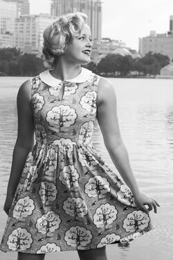
Earlier this year I donated a portrait session to a charity, including a hidden surprise of custom tailored dresses for the shoot. The winner was a swing dancer, so the style was 1950s center stage.

She was happy with them, I'm content with them, but I always like hearing some feedback / critiques.

1)
tori_cushing_april_2014__311.jpg


2)
tori_cushing_april_2014__211.jpg


3)
tori_cushing_april_2014__161.jpg


The designer was very happy with the photos and the shoot in general has netted me more than the actual cost, so I would say it was successful. Doesn't mean it couldn't be better though ;)
 
The third is my favorite here. She looks like a fun gal to shoot!
 
The third is my favorite here. She looks like a fun gal to shoot!

To say I lucked out would be an understatement, I barely had to direct any kind of movement and she would just keep moving for me without any prompting. I just turned up the jazz music and off she'd go!
 
Nice set. I love the action in #2.
 
I like the third shot for its exposure, her pose and expression, and also the background. The first shot looks okay, but the lighting seems a bit flarey; maybe it could be darkened a bit? Something about the ambient light/.foreground lighting relationship in #1 doesn't seem quite optimal. I think it would look better if the whole shot were darker and more dramatic.
 
I like the third shot for its exposure, her pose and expression, and also the background. The first shot looks okay, but the lighting seems a bit flarey; maybe it could be darkened a bit? Something about the ambient light/.foreground lighting relationship in #1 doesn't seem quite optimal. I think it would look better if the whole shot were darker and more dramatic.

I really know exactly what you mean. I was trying to play a bit with the idea of "being up on a stage" and I just don't think that pulls through as strongly as I wanted.

Maybe I should have taken off the umbrella and hit her with some really harsh light w/ a cone creating a spot light look. I was afraid of this making the scene look too harsh (something I actually really enjoy doing but could possibly be distasteful to the dancer I was shooting for) so I backed off from the idea and just used my smallest umbrella instead in the hopes that it would create a softer - but similar effect.

I might have to revisit this shot with a different model to play with the idea some more.
 
I'm wondering: how about darkening everything...and just leaving her hair, face, and arms the lightest things in the frame? That might sort of convey a sort of spotlighted, up-on-a stage feeling. Her arms are well-lighted and gracefully positioned, and I think the sidewalk and shoes and all that other low-lighted stuff will slide down pretty gracefully.
 
I like the colors and probably like #3 the best. Wondering what #3 would look like in B&W.

Sorry, couldn't resist. I can remove if you want me to. This was just using a b&w preset on photoshops editor online.

tori_cushing_april_2014__161.jpg
 
I leave my photos as "ok to edit" for a reason :) trying to explain in text what can be explored visually seems silly to me!

Lacking the full raws at the moment and time I just played around a bit with both suggestions to see how I can improve the overall photos.

tori_cushing_april_2014__161_1.jpg

Not a true conversion but I altered the color profile in ps, I'm too lazy to move the originals around and do this the right way lol. I enjoy it in black and white, but I feel the set becomes weaker with only one in b/w. That said, all three could probably be swapped over for a more consistent feel in general.

tori_cushing_april_2014__311_1.jpg


Derrel is something more like this what you are looking for? I didn't do any kind of serious split layer editing so the background light is still pretty bright (now that I added some contrast and adjusted everything to be darker, I really want that background light below her level of brightness by another two stops at least).

Usually my style is very high contrast with a strong foreground / background difference so I think what ended up happening was I didn't trust myself as much as I should have. I think the way I shoot really just plays more into these high contrast photos (like b/w) so by not pushing it far enough this time the photo ended up lacking a bit. This above photo is interesting in b/w but it becomes a bit muddier than I like, however it could be edited to be cleaner in the future.
 
Ron got the idea in my head... what about this?

tori_cushing_april_2014__311-Edit.jpg
 
D-B-J I see what you're trying to do, but it looks like the contrast is completely blown out (possibly you also sharpened the image more or just simply maxed out the clarity slider?) This is creating artificially harsh lines everywhere, like the curls in her hair for instance.

An important aspect in these photos is retaining her soft features that make her so attractive in the first place as well as making sure to accurately represent the designer's dress (because let's be honest, getting to wear something as expensive as that isn't an every day occurrence!)

My edit for this image in b/w would be closer to this:
tori_cushing_april_2014__311.jpg


Again I've kept to simpler editing as I would probably like to tone down the light on the left.
 

Most reactions

New Topics

Back
Top