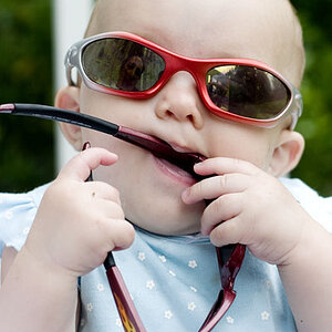
I really like this picture.
Alot.
I'm glad you got the eyes focused and crisp.
I like that that you can't see her mouth. Great composition, it's just something a little different and works very well!
As for colour...
I'd probably go B&W, but it is a very personal taste. Some people think sepia warms photos up and they like that for pictures of loved ones.
Be nice to see a B&W version.
Well, if you ask specifically: Do you like the given colour cast here then I must say as clearly: no, I don't.
But that is just me, for liking a given colour cast or not is a matter of tastes, I think. And even though (as you are bound to find out) I am the forum's "resident GREEN-enthusiast, I don't like that colour cast in connection with skin.
Plus I am having issues with the blurred bits in the foreground and shadow plays on her nose.
There may be too little of a creative artist inside me to see its merits, so again I call this a personal thing, but to me it is only distracting.
If you hadn't said that Charly's only 7 I would have thought the person here were much older than that. Did you plan for this to show?
Typed this right when Gizmo typed his comment, and see how different personal tastes are!?!?
And most of what we "critique" is nothing but a matter of tastes.
Well, I do, Gizmo: I much prefer your edit (sorry, Emma).
With the added sharpness, the blurred objects lose some of their distraction they had for me since particularly Charly's left eye now comes out so clearly and so well. Good for you to SEE that this was in the frame! And congrats to you, Emma, for having taken this photo of Charly.
Why are you saying sorry? I love the new version, had I been happy with the original, I wouldnt have postyed it here! Black and White is so much better...Moi is happy
I prefer the b&w and added sharpness, but it's a bit too dark for me now. The shadow detail in her hair and eyes has been lost a bit. My attention no longer goes to her eyes, but to her cheeks.
I think it's a good idea, just a little too strong.
I much prefer the original. I think the tone is great, if a little flat. No offense to Gizmo, but I think that the contrast and sharpness levels in the b&w edit are way too high. They give it an almost anime look.


")
![[No title]](/data/xfmg/thumbnail/35/35868-15d995e4052bf05e2038e8b2a545a08f.jpg?1619737195)
![[No title]](/data/xfmg/thumbnail/41/41780-5efe87aed04575de7c09b065d70763ae.jpg?1619739890)