dBsPhotos
TPF Noob!
- Joined
- Mar 19, 2015
- Messages
- 4
- Reaction score
- 7
- Can others edit my Photos
- Photos OK to edit
First post. Real briefly; enjoyed photography for about 4 years. Very proficient in Photoshop and I know my way around a camera. Program manager by occupation, but electrical engineer by education, so feel free to get technical with me!
The National Cherry Blossom Festival is a DC area favorite and is fast approaching. Overall pleased with my performance last year, but there's definitely opportunity for improvement. I've looked at these photos for a year now, and I'd like a fresh audience to critique it. Set me down the right course for this year.
Note: all images shot with a D7000 on a tripod with a wired trigger. Any excess sharpness is thanks to Flickr.
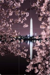
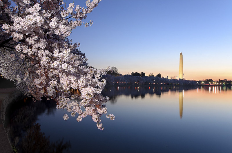
First one is the crowd favorite of the set. The editing was intentionally stylized. This was taken at ~4am and there was a slight wind which had to be contended with. I held and manually triggered a flash about 3 feet to the right of the camera. I only own a manual flash, so I don't recall the specific settings. Softened the flash with a large round diffuser and used a red/pink gel. If I were to redo this shot, I would have walked around to the left of the camera for another flash pop to create a clamshell illumination. Making this my first print soon. Thoughts?
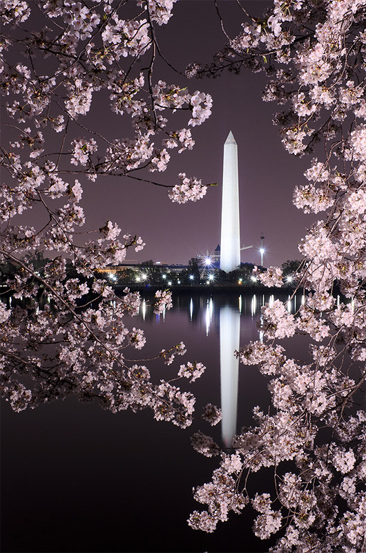 Washington Memorial Through Cherry Blossoms by DeciBels Photos, on Flickr
Settings:
Nikkor 35mm DX @ f/11
13"
320 ISO
Used flash
Second one is my personal favorite because I think the composition is as perfect as I could achieve. Intentionally chose to keep the Jefferson Memorial just a touch out of focus to keep the viewer locked between the tree/flowers and the slightly out of focus Thomas Jefferson in profile. Despite being my personal favorite, something just feels like it's missing. I can't boost the vibrance/saturation much more before it looks too fake. Would love to know where I could give this just that little bit extra.
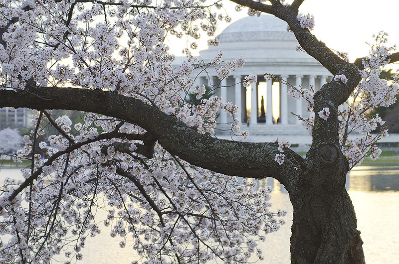 Jefferson Memorial Through Cherry Blossoms by DeciBels Photos, on Flickr
Settings:
Nikkor 80-200mm AF-D @ 80mm f/8
1/60"
320 ISO
No flash
Finally, my least accomplished from the keepers. This could have been a lot better but the technical limitations of the lens and lack of weather were limiting factors. Used a flash to illuminate the foreground. Again, with a diffuser and red/pink gel. The second flash further down the path was another photographer which happened to time my shot well. Had to photoshop out a number of photographers and camera equipment from this shot to clean up the foreground. Now have the infamous 14-24mm, and I will be renting the D810 for this years event, so I'll have another chance at this photo.
 Tidal Basin Cherry Blossoms by DeciBels Photos, on Flickr
Settings:
Tokina 11-16mm V1 @ 16mm f/11
4"
400 ISO
Used flash and "borrowed" another
So let me know how I could do a better job this year! I like to always be upstaging myself.
The National Cherry Blossom Festival is a DC area favorite and is fast approaching. Overall pleased with my performance last year, but there's definitely opportunity for improvement. I've looked at these photos for a year now, and I'd like a fresh audience to critique it. Set me down the right course for this year.
Note: all images shot with a D7000 on a tripod with a wired trigger. Any excess sharpness is thanks to Flickr.
First one is the crowd favorite of the set. The editing was intentionally stylized. This was taken at ~4am and there was a slight wind which had to be contended with. I held and manually triggered a flash about 3 feet to the right of the camera. I only own a manual flash, so I don't recall the specific settings. Softened the flash with a large round diffuser and used a red/pink gel. If I were to redo this shot, I would have walked around to the left of the camera for another flash pop to create a clamshell illumination. Making this my first print soon. Thoughts?
Washington Memorial Through Cherry Blossoms by DeciBels Photos, on FlickrSettings:
Nikkor 35mm DX @ f/11
13"
320 ISO
Used flash
Second one is my personal favorite because I think the composition is as perfect as I could achieve. Intentionally chose to keep the Jefferson Memorial just a touch out of focus to keep the viewer locked between the tree/flowers and the slightly out of focus Thomas Jefferson in profile. Despite being my personal favorite, something just feels like it's missing. I can't boost the vibrance/saturation much more before it looks too fake. Would love to know where I could give this just that little bit extra.
Jefferson Memorial Through Cherry Blossoms by DeciBels Photos, on FlickrSettings:
Nikkor 80-200mm AF-D @ 80mm f/8
1/60"
320 ISO
No flash
Finally, my least accomplished from the keepers. This could have been a lot better but the technical limitations of the lens and lack of weather were limiting factors. Used a flash to illuminate the foreground. Again, with a diffuser and red/pink gel. The second flash further down the path was another photographer which happened to time my shot well. Had to photoshop out a number of photographers and camera equipment from this shot to clean up the foreground. Now have the infamous 14-24mm, and I will be renting the D810 for this years event, so I'll have another chance at this photo.
Tidal Basin Cherry Blossoms by DeciBels Photos, on FlickrSettings:
Tokina 11-16mm V1 @ 16mm f/11
4"
400 ISO
Used flash and "borrowed" another
So let me know how I could do a better job this year! I like to always be upstaging myself.