pharmakon
TPF Noob!
- Joined
- Aug 7, 2009
- Messages
- 365
- Reaction score
- 7
- Location
- Western NC
- Can others edit my Photos
- Photos OK to edit
I'm a late admit into Bitter's evil school of photography. The following is my catch up on assignment #1, a beverage shot, using rule of thirds.
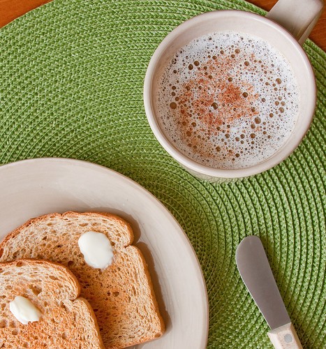
The goal of the shoot was to present the beverage in an appealing way, that would make the viewer want to drink it. In my photo I chose to feature a cup of coffee within a breakfast theme. I wanted to keep the image clean, generic enough to be suitable for stock, but still appealing and able to keep a viewer's attention. I felt that the circular pattern of the placemat went well with the other round objects in the shot, and the green color broke up the beiges and browns in the rest of the scene. I also kept the lens as wide as possible and got in close to try to exaggerate the size of the coffee cup via perspective distortion.
The photo was shot on a tripod at 1/5 second, F/10, 28mm, ISO 100. (28-135mm lens as listed in sig)
The photo was lit via pulling the table right up to a north facing window, and placing 2 reflectors for fill opposite the window.
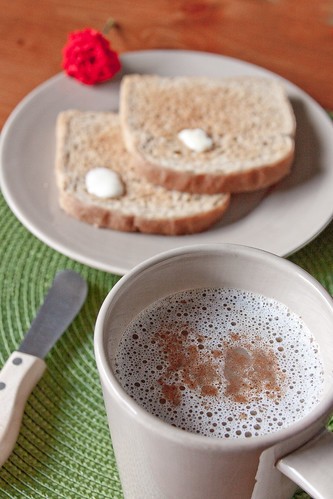
And my runner up: an alternate angle and smaller DOF. The DOF draws more attention to the coffee, but I think the bright flower spoiled it.
Handheld, 1/80sec @ f6.3, 28mm, iso640
Your C&C is greatly appreciated.
The goal of the shoot was to present the beverage in an appealing way, that would make the viewer want to drink it. In my photo I chose to feature a cup of coffee within a breakfast theme. I wanted to keep the image clean, generic enough to be suitable for stock, but still appealing and able to keep a viewer's attention. I felt that the circular pattern of the placemat went well with the other round objects in the shot, and the green color broke up the beiges and browns in the rest of the scene. I also kept the lens as wide as possible and got in close to try to exaggerate the size of the coffee cup via perspective distortion.
The photo was shot on a tripod at 1/5 second, F/10, 28mm, ISO 100. (28-135mm lens as listed in sig)
The photo was lit via pulling the table right up to a north facing window, and placing 2 reflectors for fill opposite the window.

And my runner up: an alternate angle and smaller DOF. The DOF draws more attention to the coffee, but I think the bright flower spoiled it.
Handheld, 1/80sec @ f6.3, 28mm, iso640

Your C&C is greatly appreciated.



![[No title]](/data/xfmg/thumbnail/36/36300-760519cb9a8ebbfc57cc3d1fda5dd37c.jpg?1619737494)
