Hmmm, it's not fully black and white-- I definitely see some blue in there.
The photo itself is nice, including the composition, but there's something lacking. It's a little too dark, and seems underexposed. Everything's washed out and doesn't really seem to pop for me.
I like the idea... but it lacks definition. Maybe working on levels and can spread out the black part a bit into the greys... but i don't even think there is much detail to save . Good concept but it needs work to achieve this
I agree with the previous comments. In my opinion the flowers should either be all black or have the vast majority of their detail. If there isn't any information in the flowers I would just drown them out such as in your avatar.


")
 393
393 305
305 280
280 260
260 249
249 195
195 189
189 182
182 178
178 158
158 145
145 133
133 127
127 116
116 93
93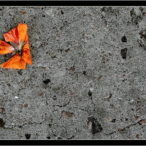
![[No title]](/data/xfmg/thumbnail/36/36299-468f060314a0ac2bf5e37da1c33149d2.jpg?1619737493)


![[No title]](/data/xfmg/thumbnail/36/36601-26ec0a53712c5470af53be9652811a6e.jpg?1619737641)


![[No title]](/data/xfmg/thumbnail/40/40356-883c642c8d24d2709b359f9c8b196fcf.jpg?1619739437)