Cliche Guitar Pics

rufus5150

TPF Noob!
Joined
Mar 8, 2008
Messages
1,658
Reaction score
2
Location
Austin, Texas
Website
www.toddmckimmey.com
Can others edit my Photos
Photos NOT OK to edit
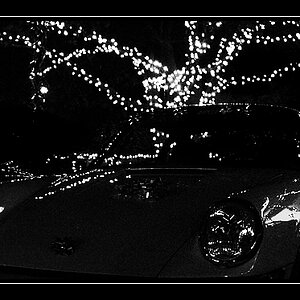
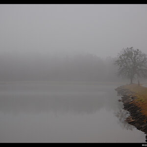
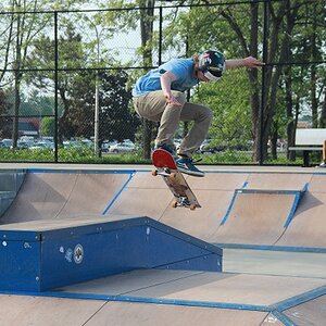
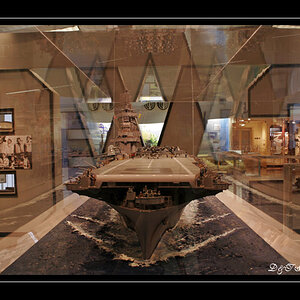
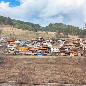
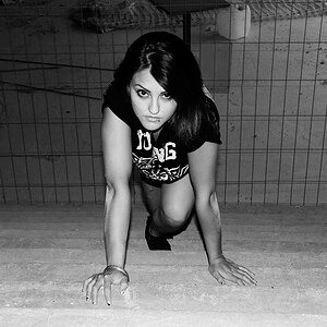
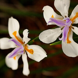
The subject matter and composition are cliche, but I wanted to get used to my new tripod as well as try a few other things. So I guess I'll ask specifically for C&C on the execution and post processing since I've already fessed up to committing the 'we've seen it a bazillion times' sin! :)

First is obviously in color. The other 3 used different techniques for the conversions and I did a slight bleed-through of the original, non-converted image on each (around 3-7% or so).

Thanks in advance for any comments.

#1
guitar_1_5x7.jpg


#2
guitar_2_5x7.jpg


#3
guitar_3_5x7.jpg


#4
guitar_4_5x7.jpg


Thanks for looking!
 
Last edited:
I like em (in this order), nicely executed! I actually built an acoustic guitar in curly koa,.. I will try and grab a sampling..

The post work is nice IMO, nothing overdone - artfully enhanced.

-Shea

KOA:
shea_koa-guitar-detail_IMG_3102.jpg
 
Last edited:
Thanks for the comments, guys.

Surely there's got to be some 'hey you did this wrong' C&C out there, too, though. Anyone?
 
Overall nice shots.

I don't think anyone can say "you did this wrong" because everything's so dependent on personal taste... You don't have any blown out spots etc. that I can see.

One suggestion I have though for #1:
I'm a fan of symmetry in shots like this, so I would have liked to see the design around the sound hole centred. I guess that would mean the strings would be centred in the frame too.
 
Surely there's got to be some 'hey you did this wrong' C&C out there, too, though. Anyone?
On request :)

Number 1 seems to be just a tad too dark. I like the fact that the sixth element (don't know the proper name) looks different than the other five.

Number 2 seems to have a couple hot spots.

Number 3 is just beautiful. I like how the out-of-focus sections of the strings seem to be wider. The dark chocolate tone adds a lot to the image in my opinion.
 
Liking these a lot. The only criticisms I could level at you the lack of symmetry as Sim said and dust that headstock, it's a disgrace. ;)

Oh and you're using my pick of choice so obviously you rock. \m/
 
One suggestion I have though for #1:
I'm a fan of symmetry in shots like this, so I would have liked to see the design around the sound hole centred. I guess that would mean the strings would be centred in the frame too.

The only criticisms I could level at you the lack of symmetry as Sim said

I love symmetries, but I like what Rufus did here; he calls it cliché, but it's actually different.
 
Thanks for the replies. I'm planning to reshoot a couple and I'll try the first with a bit more symmetry just as an exercise. :)
 

Most reactions

New Topics

Back
Top