Clouds behind a church

Does blur in this photo help?


  • Total voters
    29

anton980

TPF Noob!
Joined
Dec 14, 2004
Messages
256
Reaction score
2
Location
Newport News, VA
Website
www.antonimation.com
Can others edit my Photos
Photos NOT OK to edit
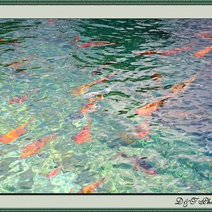
I wanted to get some opinions on this photo. Personally I really like the way it turned out, but I've been hearing mixed reviews on it from my friends. Do you think the blur helps the image, or takes away from it?

Church.jpg
 
Woo hoo I got to be the first vote.

I really like the pic and the sky (though I might crop it down just a tad).

As for the blur I wouldn't see the value in it. Like when you look at the picture what do you see that would benefit from being blurry. In general I think blur is awesome to use and to know how to control and add into a pic but it's usually there for a specific purpose (make a foreground subject pop out, show motion, turn lights into lines at nite, etc).

For me, in looking at this picture I don't see any value that blur would bring.
 
(mr garrison)blur is bad m'kay? (/mr garrison)

echoing previous comments, i don't see the blur in the stationary church being any asset to this picture, unless there were demons flying out of it or something... if there was an action associated with the blurring effect, maybe then it would be appropriate, otherwise, i'd leave it out :)

the upside, is you can probably reshoot the shot and just PS the clean non blurry chuch/trees into the shot of the cool sky... or vice versa.

btw what a bleak looking photo, other then the blue sign and cool cloud, it's so dreary looking
 
I love this picture. If you dont mind me asking, is the church blurred and the clouds not? either on purpose or from autofocus? I am having trouble telling if the clouds are blurred or not. if the clouds are clear and the church is blurred I think this is great. The attention is drawn to the crazy looking (any PS work?) sky and with the foreground being slightly blurry, I find myself spending hardly any time looking at the church in this shot; you'll have to decide if thats a good thing or a bad thing.

If this has any post processing I hope you're willing to share your secrets.
 
xfloggingkylex said:
I love this picture. If you dont mind me asking, is the church blurred and the clouds not? either on purpose or from autofocus? I am having trouble telling if the clouds are blurred or not. if the clouds are clear and the church is blurred I think this is great. The attention is drawn to the crazy looking (any PS work?) sky and with the foreground being slightly blurry, I find myself spending hardly any time looking at the church in this shot; you'll have to decide if thats a good thing or a bad thing.

If this has any post processing I hope you're willing to share your secrets.

Thanks for replies everyone!

The clouds are in perfect focus, actually. I wanted the focus to recede as it gets closer to that bottom right corner being that it's the most dense area (as far as amount of detail goes). Aside from that, I feel blurring and color I went with gives this photo a "nostalgic" grainy and almost black and white feel so to speak. The original photo is actually very colorful and I didnt like that, as color really distracts from the sky. If anyone is interested, I can post the original, unprocessed photo here. The attention grabber here is naturally the sky, so when you say you spend hardly any time looking at the church itself - I take it as a compliment.

As far as postprocessing - this image is built from 3 identical photos that were darkened somewhat to create that "crazy sky" look. To achieve the blur the photos were slightly rotated so that top of the image stays in focus and you get less and less of that as you get to the bottom (think of it as a faked tilt shift lens effect). Hope that helps! If you want me to get more specific, let me know.

Anton
 
I'm glad that the fact I dont pay the church much attention was your intention, shows that you've reached your goal (at least with me) I am however interested in seeing the original if you dont mine. I really enjoy the colorless feel of the sky, but how there are spots of blue, such as the top left corner.
 
I would've probably focused more on the lighting and bringing out the white. It's got a great feel, but I barely notice the blur. I do love this shot.
 
Here's an original:


Church_Original.jpg


I think it's the one I've modified. As I said I've taken quite a lot of shots of the same church with that cloud behind it. The blue area in the top left is the remains of a more-saturated part from the original. That part is barely covered by the clouds, so I guess it retained it's color better after I desaturated the image.
 
I really like what you're trying to do visually with your composition. However, I think the blur on the church takes the focus away from the clouds. The sky is so powerful that IMO, you need no distractions, and something out of focus is a distraction.
 
I personally think either the original or the edited versions are great, can't deside which I like better.

as for the blur... I can't see it.
 
I really like this photo. It looks really menasing :0)
In a good way.

I love that you chose to keep the blue door.

The sky is just great and the church really fits with it.

I like the mention of demons flying out of the windows. :0)

I personally don't like blur in this one. It's nice but nessasary I think.

Nice shot.
 
I like it without the blur, it takes away form the photo especially since the clouds are so strong but I'd also look into straightening the bottom. That's a tad bit distracting.
 
Overall, I prefer the first image posted. It has atmosphere about it.

It's difficult to see on my monitor however, because I use an unusually high resolution, making the image small. (yeah, I could change my screen resolution, but without going into detail, let me just say that "it's impractical for technical reasons").

What I seem to see is a bit of doubling of the image toward the bottom right. I don't think it works terribly well... you could instead try a more intese gaussian type blur, with which I'd also suggest burning the area in (darkening it). Or, just try burning it in without blur.

I think it'd be pretty effective... especially if you burnt evenly across the entire bottom of the image where the street is, emphasizing the brilliant light in the sky.

I like the idea behind the image, definately. Nice thinking!
 

Most reactions

Back
Top