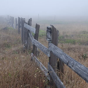
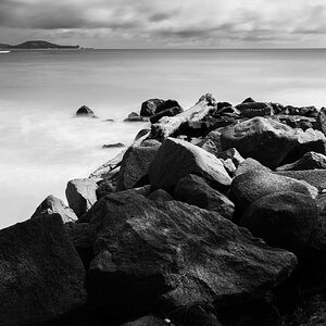
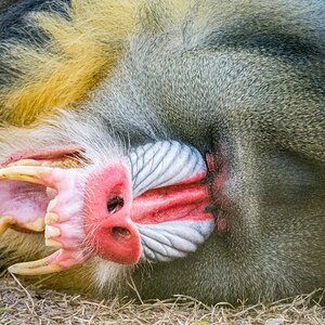
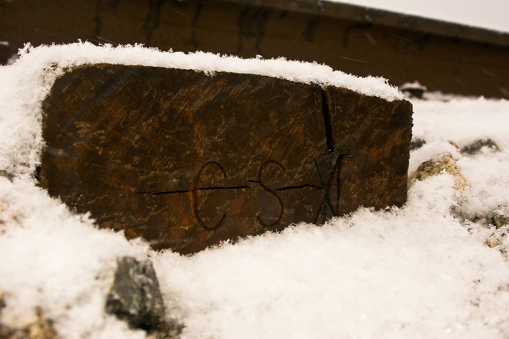
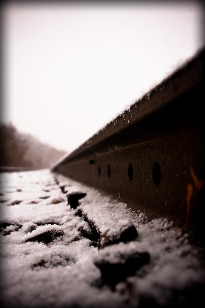
I like the third photo the best, due to its overall balance and the way the sky was handled. In the first photo, I do not like the way the sky looks "out of whack", so to speak. The same type of tone posterization ruins the lst photo for me--the tones have been pushed so far in post that the edges are posterizing, which is something that doesn't sit well with me.


![[No title]](/data/xfmg/thumbnail/34/34065-43f99c081a04bd087c00711d2fe010ee.jpg?1619736261)

![[No title]](/data/xfmg/thumbnail/34/34061-e097813b3719866d07ff3e78e8119ffa.jpg?1619736258)