Cologne

THORHAMMER

No longer a newbie, moving up!
Joined
Dec 24, 2005
Messages
2,789
Reaction score
8
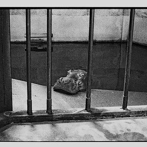
Just playing around, experimenting with angles and light.

didn't really get the look I was shooting for, but its interesting.

ps. I added the weird looking blur around the bottle on purpose just

experimenting. nothing serious on this one.


20070630-IMG_1521cropped.jpg
 
Well, at the very least the bottle should stand out more from the background, particularly the lower front. Logo and name should also stand out much more vividly and with greater contrast.

skieur
 
I totally agree !! I just thought there was something interesting or moody about the shot.. I approached it like a landscape not a commercial picture. I can see that one well placed reflector for the label might have made all the difference in the world
 
By the way, I would use a curve background to prevent the LINE behind this product. I have also used dark velvet because it does not reflect light and isolates the product.

skieur
 
thanks,

the line is there from the fake blur I make around the bottle. its not there in

the original...
 
thanks,

the line is there from the fake blur I make around the bottle. its not there in

the original...

I meant the "horizon line" between the red shade and the blue. Surely that is in the original, no?

skieur
 
nope, its not there in the original, ill post a pic later if you want.
the light more at an angle and the background wasnt that close , prob about 10 feet away
 

Most reactions

Back
Top