Color Landscapes

Where were the smileys?! We need smileys to determine jokiness, dammit?! What about the smileeeeeeyyyyyyysssssssssssss???!!!!!


(I've been editing photos for a loooooonnnnngggggg time tonight. :shaking: :drunk: )
 
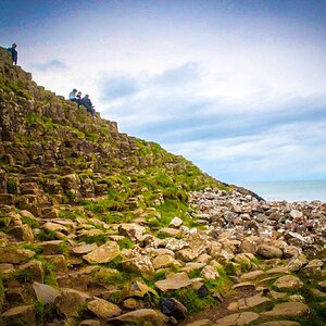
I like the contract between the colors in #1 a lot
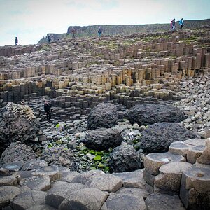
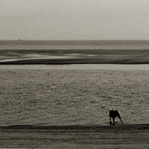
#2 doesn’t work for me as it is; think I would like to see a panoramic crop of the top 2/3 but that just my option
 
I like the first one because of the subdued color interplay but the second one appeals the most and I don't know why.
 
canonrebel said:
Of Course I was making a funny!

Matt Needham is a professional photographer. By the term professional, I mean to say that photography is a source of income for him.

Sorry for the confusion.

Check out his gallery at....

http://www.mattneedham.com

Rememberrrrrrrrrrrrrrrrrrrrrrrrr the smiley'sssssssssssssssssssssss next time! You had us worried for a minute there :shock:
 
:scratch: first posting in the off topic, then posting colour shots - this is strange occurance. I really like the composition in both, definately not your calendar landscapes.

The colours seem to have bit too much of a greenish cast, at least on my my screen - especially in number 2. I love the foreground in that though. I am sure that one looks good in the full print. Was it the film or post processing that made the colours come out like that (ie intential)?
 
I personally don't care for these shots... at this resolution. I would love to see them at their original size. At the shrunken size I see here, they aren't given justice.

As far as canonrebel's post, I think most of you missed this line...

canonrebel said:
Now for the serious part :) :).
 
vonnagy said:
:The colours seem to have bit too much of a greenish cast

I think so too. I'm pretty good at color correction via the CMY dials on a color enlarger, or a lab printing machine, but I'm still learning in Adobe PS (and I don't get much practice since I'm always messing with BW).

Usually I go into the RGB channels and adjust the levels: just tucking in the highlights and shadows to the edges of the histogram. The lighting on this day was strange with the mist and fog, so that hasn't been good enough. I'm going to have my photog buddy who does mostly color landscape teach me his techniques. He was shooting with me the same day these were taken.

I personally don't care for these shots... at this resolution. I would love to see them at their original size. At the shrunken size I see here, they aren't given justice.

I really need to do a better job of picking pictures that post well. I'm sitting at home looking at a 16x20 color print (traditional) of the first shot; you can see the lines on the individual blades of grass. Everything is crisp and clear (and the color is better :lol: ). I do shoot a lot of these "texture" shots, that many folks probably find boring, with my MF and LF gear, and no one is going to see what I'm seeing if they can only view a 72 dpi/500 pixel image.
But it's hard not to post when you are excited about a photo :D
 
Maybe some of the tension can be relieved if the entire thread were to be taken into consideration. :D *WOW, these smilies are simple*

These are my posts at the beginning of the thread...
canonrebel wrote:
I really like #2. It is great. It has an isolated focus point almost as if it were intentionally manipulated. Good image.
lim ming han said:
ur photo will look good for a normal people
but as a professional
i really cant say any good about your photo
i see poor composition, that is what u are trying to tell us in the photo
i see nothing, no subject only some zig zag pattern or inorganised pattern in ur photo
nevertheless good try keep it up

canon rebel wrote:
Usually, when people submit their images in this forum they are not seeking serious critique. They are merely sharing with us. The "critique" section is usually reserved for more serious critiques from professionals.

These were my posts and I'm stick'in to'em :D
 

Most reactions

New Topics

Back
Top