- Joined
- Feb 1, 2004
- Messages
- 34,813
- Reaction score
- 822
- Location
- Lower Saxony, Germany
- Can others edit my Photos
- Photos NOT OK to edit
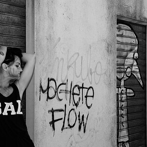
So here I am back to using colour film for prints are just soooo much cheaper (by 300%!).
But I have felt inspired enough to try something out in Photoshop with some of my (primarily colour) photos.
Here's my question to you then: "Colour? Or no colour?"
Is it all a matter of taste only?
Have a look at a few "before" and "after" photos:


Winter tree


The River Wümme in winter


Dilapidated shed


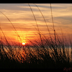
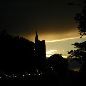
Dramatic sky
But I have felt inspired enough to try something out in Photoshop with some of my (primarily colour) photos.
Here's my question to you then: "Colour? Or no colour?"
Is it all a matter of taste only?
Have a look at a few "before" and "after" photos:
Winter tree
The River Wümme in winter
Dilapidated shed
Dramatic sky


![[No title]](/data/xfmg/thumbnail/35/35963-4809c92024a0e6355dd194caf9297701.jpg?1619737279)