rachelnan
TPF Noob!
- Joined
- Sep 20, 2008
- Messages
- 15
- Reaction score
- 0
- Location
- Arkansas
- Can others edit my Photos
- Photos OK to edit
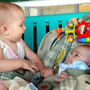
1.
2.

I am very excited about learning how to take better photos and do better editing. I am most concerned with lighting and would appreciate any comments or critizisim.
Thanks!!!
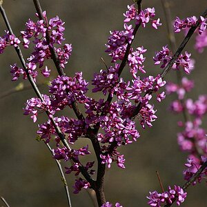
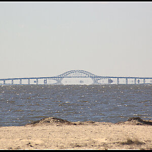
2.
I am very excited about learning how to take better photos and do better editing. I am most concerned with lighting and would appreciate any comments or critizisim.
Thanks!!!
![[No title]](/data/xfmg/thumbnail/34/34746-f8e4b50f9d9b0de43c95af3d2caf956b.jpg?1619736628)

![[No title]](/data/xfmg/thumbnail/32/32006-4103e122cb8d7b8d8e41a423124446b7.jpg?1619735151)