JeffieLove
No longer a newbie, moving up!
- Joined
- Feb 8, 2010
- Messages
- 1,601
- Reaction score
- 15
- Location
- Elkton, MD
- Can others edit my Photos
- Photos OK to edit
This is all the same shot... just some different PP done. I just want to see which you all think is better... or if there is another way I should do what I'm doing, or if there is a better way to do the PP on this in general...
The story behind this photo and why I am trying to get the effect I am going for:
This is Ashley. She is in a local zoo here. She is 19 years old and tigers are only expected to live 18-20 years in captivity. I would like to be able to show this picture to the zoo and see if they would like to use it when Ashley passes.
(If you need any of the shots bigger so you can play with them in PP yourself, let me know)
Original:

Edit 1: I have already been told that the lighting effect filter on this from PSE8 sucks... That is all I did to this one.
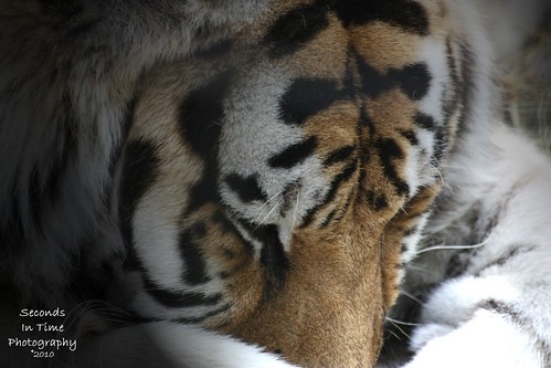
Edit 2: I fixed the lighting effect filer in this and also added some saturation and contrast. It was mentioned in comments on Flickr that the colors in the first edit were too "muted". So I played around with the light effect filter and got rid of that blown out highlight on her paw...

The story behind this photo and why I am trying to get the effect I am going for:
This is Ashley. She is in a local zoo here. She is 19 years old and tigers are only expected to live 18-20 years in captivity. I would like to be able to show this picture to the zoo and see if they would like to use it when Ashley passes.
(If you need any of the shots bigger so you can play with them in PP yourself, let me know)
Original:
Edit 1: I have already been told that the lighting effect filter on this from PSE8 sucks... That is all I did to this one.
Edit 2: I fixed the lighting effect filer in this and also added some saturation and contrast. It was mentioned in comments on Flickr that the colors in the first edit were too "muted". So I played around with the light effect filter and got rid of that blown out highlight on her paw...
")
![[No title]](/data/xfmg/thumbnail/42/42468-f720ff996eb9cc6554c0019901223156.jpg?1619740193)

![[No title]](/data/xfmg/thumbnail/35/35262-02f8eba4a2a92dbae0b55547bba80b4f.jpg?1619736968)
![[No title]](/data/xfmg/thumbnail/35/35872-12704b8c65e1c009d7089ccba367abb6.jpg?1619737198)
![[No title]](/data/xfmg/thumbnail/42/42272-c0d91b9d0872bcdfbcdfb5bb0529e302.jpg?1619740081)