Complete Novice... some of my first shots

mbates2

TPF Noob!
Joined
Jul 7, 2010
Messages
3
Reaction score
0
Location
Chicago
Can others edit my Photos
Photos OK to edit
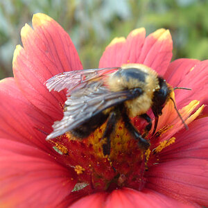
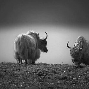
What do y'all think? How can I make them better? How are they good, or just plain bad? I'm starting out as a hobbyist, but would potentially like to make something more of this...

DSC_0081.jpg


DSC_0149.jpg


DSC_0205-1.jpg


DSC_0017-1.jpg


DSC_0089-1.jpg


DSC_0045-1.jpg


CSC_0126.jpg


DSC_0021.jpg


DSC_0164.jpg


DSC_0209.jpg
 
The one with the silver ball and reflection is the best in my opinion . The composition seems good but i think there is too much white in this picture and it hurts the eyes
 
The one with the silver ball and reflection is the best in my opinion . The composition seems good but i think there is too much white in this picture and it hurts the eyes

+1 I think perhaps you cranked up the contrast a bit too much in PP, but I see what you were going for.
 
The one with the silver ball and reflection is the best in my opinion . The composition seems good but i think there is too much white in this picture and it hurts the eyes

+1 I think perhaps you cranked up the contrast a bit too much in PP, but I see what you were going for.


So maybe town down the contrast a bit? What about the subway shot with a similar effect?

Well, I have to admit I'm no expert, but you might be able to get a similar effect on the subway shot by upping the saturation instead of the contrast, but I'm not really sure it would make the photo any better. It might be interesting to see the originals if you have them.
 
You have a good eye for shots, but you have to work on the composition. Almost every shot has your subject being cutoff on the edge of the frame. This seems to still work in the picture of the kid in the rain or whatever it is, but in the other shots it kills it for me. I like the one showing the girl walking in the crowd (aside from any religious/political debate :lol: 
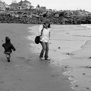
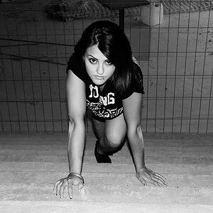
), but again, her left side is cut off.

I think the subway shot is way over processed ( as well as the shot of the silver sculpture. The sculpture is just too heavy on the blacks but the subway shot is very noisy and sort of overbaked so to speak, but I guess this is all personal taste.
 
In terms of originals...

DSC_0089.jpg


DSC_0045.jpg


And in terms of cutting people off while composing, are we just talking left/right side or also top/bottom... what are some good rules to follow when composing.

oh, here is a black/white i did of the subway shot

DSC_0089-2.jpg


and here's the uncropped version of the little boy in the fountain (Crown Fountain, Chicago)

DSC_0082.jpg
 
I think the originals of the subway tunnel and sphere are good on their own. With the tunnel, it has a certain mood to it. And as for the sphere, the colors are pretty vibrant and have depth. B&W washes all that away.
 

Most reactions

New Topics

Back
Top