Couple of night shots for c & c

Lazy Photographer

TPF Noob!
Joined
Jul 4, 2009
Messages
648
Reaction score
5
Location
Toronto, Canada
Website
lazyphotographer.ca
Can others edit my Photos
Photos OK to edit
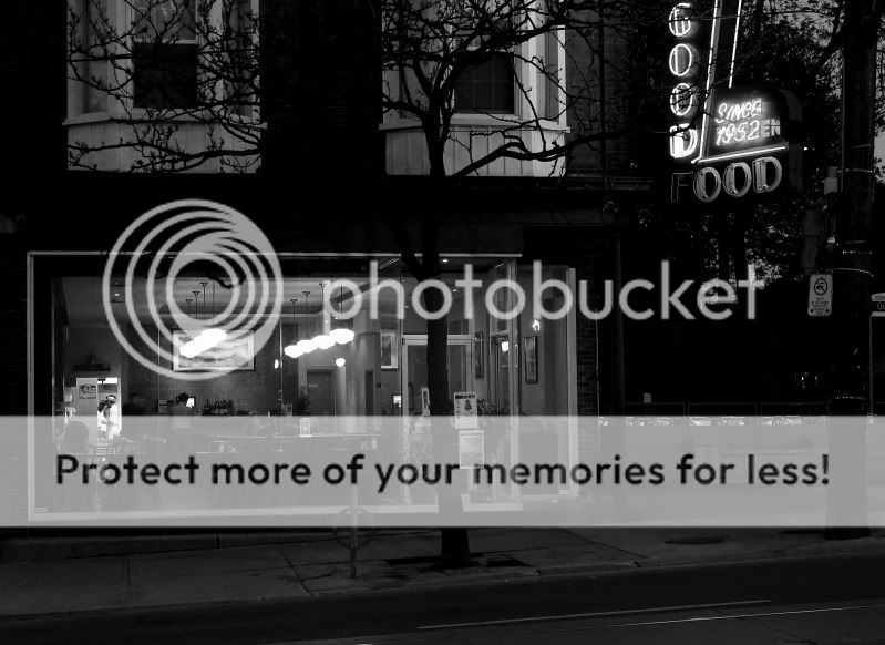
The first shot is with my new T2i. The second one's from my old point & shoot. I'm finally getting comfortable with night photography with the T2i but I think I darkened it too much in Photoshop.

1.
MayNight-091-EDIT3.jpg


2.
HeritageLights-033EDIT2.jpg
 
Interesting.

Yeah, the first one is a bit too dark for my taste as well. The construction cones on the right just killed it. Also the signs to the right and left of the cafe are too distracting.

With a bit of Photoshop it shouldn't be a problem.

The exposure in the second shot looks ok but the skyscraper in the background appears to be "growing" out of the truck :meh:.

A different angle would have done the trick in order to avoid that.
 
I agree with the points above and would add that I do not much care for the B&W treatment, it just doesn't look realistic to me.

Allan
 
It probably doesn't appeal to you (flea77) because the B&W of the first is yellow-y, you need to take out any saturation there is there. And yes, it's too dark. I did an edit, but the darkness is too much and can't be reversed. I just had to get rid of the butter flavor it had, it was hurting me. Lol, then after that, I wanted the whites to pop a bit more but not be blown out, but the blacks are way too dark and you could tell there's too much contrast. Also, my edit looks hazy cuz I tried lightening it up on Photobucket but at least the yellow is gone. :) (my laptop is down & it has my PS) So whip out the original and re-edit it, just to get the yellow out, and to get the optimum contrast. Don't get me wrong, it does have lovely tonality ranges: blacks, whites, and grays, but too much darkness. :)
finals.jpg


The second shot beats out the first one for me.
 
Last edited:
Thanks everyone, very helpful. And thanks a million Sbuxo for offering an alternative fix. I really like what you did here, especially the crop. In photoshop I can select the storefront itself, inverse the selection, then lighten everything but the interior, saving the lit parts from being blown. I'll post a second attempt later.
 
imo first one looks soft and doesn't seem too interesting to me

i greatly prefer #2, though like a prev. poster said the composition could be fiddled with since the building merges with the truck
 

Most reactions

Back
Top