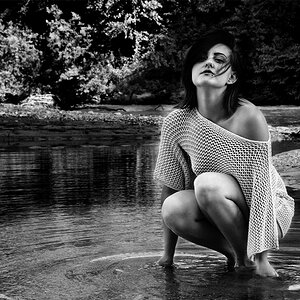
I think on #1, she's a little too square on to the camera. Not a very flattering position for a girl. Gives the appearance of broader shoulders.
I also find the background a little too distracting.
#2: I don't see enough of her face. On a profile you would ideally like to see one of everything (one mouth, one eye, one nose). Maybe you could have her tuck her hair behind her ear a little bit.
I'm sorry, these poses remind me of a wanted poster I agree with twocolor's assessment of both images. I'd also suggest avoid having your subjects look into the sun; even when they try hard, their expressions are never quite natural. You're very close, I'd say another try should nail it.
and I agree that having the sun in her face does not help her facial expression!
The second image is cool in a way. just her character gets lost because you cannot see much of her face. just a tad more of her face and less sun in her eyes, and it could be a great image!!
The second image is cool in a way. just her character gets lost because you cannot see much of her face. just a tad more of her face and less sun in her eyes, and it could be a great image!!
I agree. If you get a chance to shoot with her again Try # 2 again. This time have her start by looking like she is now, then tell her to turn her head a little to her right (theres a kinda rule that says the nose should not extent pass the cheek) Would be cool to if she is not looking at the camera as well. That should be a vey nice image!
#1 background is too busy, and she has hot spots (bright areas) on her nose, cheeks, lips and forehead. It looks like she just ate a very sour lemon. Try to balance out the color more and use photoshop to tone down the hot areas.
#2 is a great effort, however; the trees are not a great background and her nose is too bright. Nice highlites in the hair.
You have the ideas right, you just need to practice

")


![[No title]](/data/xfmg/thumbnail/33/33357-bd174890e33fb2a7f7338b9278e6dad2.jpg?1619735920)

![[No title]](/data/xfmg/thumbnail/35/35668-5ed46d3abc5acbedc69d68e0c3a2173a.jpg?1619737090)
![[No title]](/data/xfmg/thumbnail/33/33358-426ca644c08fb31a8cc23232f17de8dd.jpg?1619735922)
![[No title]](/data/xfmg/thumbnail/37/37606-3c9ffb5906173fa2aa489341967e1468.jpg?1619738148)
![[No title]](/data/xfmg/thumbnail/37/37602-1ef8dbb1c2d0e4ff347ee65d328c3603.jpg?1619738147)