Crater Lake C&C, crop, and post help

LakeFX

No longer a newbie, moving up!
Joined
Dec 1, 2013
Messages
117
Reaction score
40
Location
Eugene, OR
Can others edit my Photos
Photos OK to edit
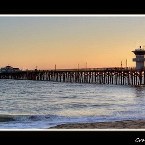
I have a free 20x30 metal print and I want to use it for an image of Crater Lake that I made at sunset this summer. I'm struggling with two different issues.

The first is how to crop the image into a 5:4 format. Ideally I would print a wide panorama crop, but those are expensive and I want to use my free print. I may print it that way later if this one turns out well.

The second issue is that I'm fairly new to post processing and I'm not sure what would help the image work more. I'd love some suggestions.

Of course, I'd love some general C&C as well since I always want to learn more.

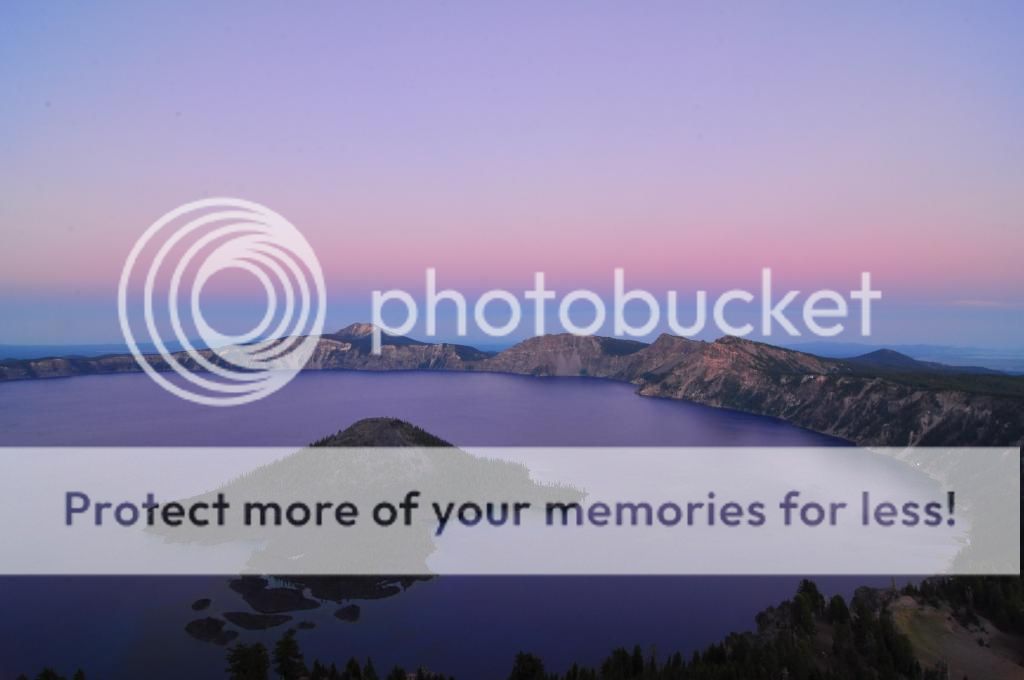
So here is what I'm working with:

The original image shot with a D90 in M mode and Tokina 12-24 on a tripod, f/18 1.6" exposure iso 200.
DSC_2472.jpg

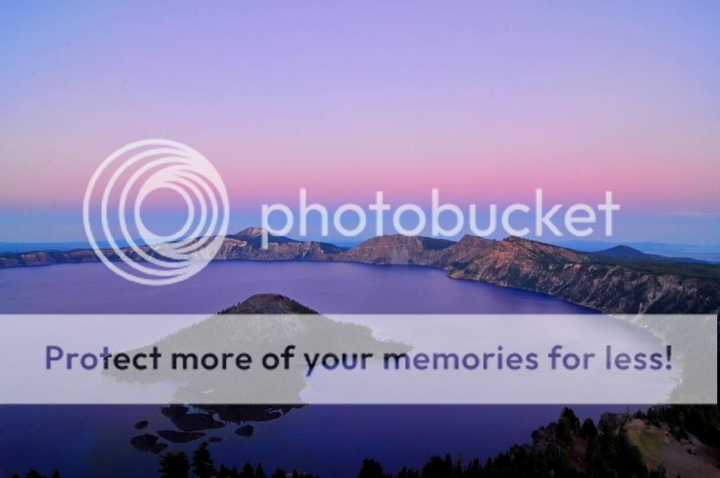
My first effort at post-processing. Reclaimed some shadows, increased contrast and saturation:
DSC_2472_edit.jpg

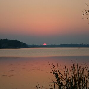
And my first effort at cropping. I'm not sure I like this crop, but I struggled to find a 5:4 crop that really works:
DSC_2472_edit_crop1.jpg


Thanks for your help!
 
I've been using FastStone, but I have access to a lot of other options too.
 
Is that the right color? There seems to be a lot of pink in there, but it could be correct and I would have to take your word for it.

If not, Here is my version of WB.

Here is where I would crop given the 4x5 aspect ratio that you specified.

DSC_2472_edit - Version 2.jpg
 
Last edited:
I can't say for sure that the pink is "accurate" because I took this about 6 months ago. I was facing away from the sunset and I do remember interesting colors in the clouds.

I'm not really concerned with accurate color representation. I just want a fun piece of art for the wall, but I want the art to be representative of my work with the camera, not the really low quality of work I would do with a lot of photo editing.
 
Designer, what did you change with the WB?
 
I can't say for sure that the pink is "accurate" because I took this about 6 months ago. I was facing away from the sunset and I do remember interesting colors in the clouds.

I'm not really concerned with accurate color representation. I just want a fun piece of art for the wall, but I want the art to be representative of my work with the camera, not the really low quality of work I would do with a lot of photo editing.

I have a very good color memory. Maybe it comes with practice.

Seriously, if you want the photograph to be tinged with magenta, then by all means keep it that way. It's your house and wall, after all.
I struggle with color, which is part of why I very much appreciate your help! I need to look closely at the difference between what you did and my original to really examine the colors.
 
how nice it is! good shots
 
I am no expert and this is just my take. I would add more depth to the sky and lighten by taking some of the shadow out. I like the bottom of the photo on the right with the orange dirt hill and trees but you can't really see it. The magenta water is a little much as well and I would tone that down. Again just my opinion and the adjustments will take better on your RAW file than me editing a tiny JPEG but you get the jist. Oh don't forget to take the marks out on the top left. Looks like dust on your sensor or lens.

I like the shot was it taken from a plane?

s2 (1 of 1).jpg
 
Thanks! I'll definitely need to play with the colors a bit. I'm visiting family now and didn't bring my laptop so it will have to wait until next week.
 
Oh, and the shot was taken from a fire tower on top of a peak.
 
I finally had time to really sit and play with the colors. I switched to LR because the color management in FastStone is pretty painful. I remember the water looking somewhat purple, so I used that as a guide. What do you think? Do I need to go a little cooler?

I also decided I don't like the 4x5 crops so I'm going to use a different image for my free metal print and then pay to have one of this done at some point with a wider crop.

 
I think it's a VERY good decision to go with something else for the 20x30 print! Trying to force this image into a 4x5 crop that doesn't lose something wasn't going to happen.

As for the photo itself--it's all going to come down to a matter of taste, which is why you are getting such a wide variety of suggestions on the "right" color rendering. Personally, I think you're getting much closer with that last edit. If you could hit somewhere between the last edit and Designer's edit, I think you'd be very pleased with the results.

Also, just something to be aware of and perhaps ASK the printer about before having this printed; sometimes (often with regular prints, but not sure about with a metal print) an actual print of a photo is going to seem a little darker than it does on your monitor. For this reason, I often give a bit of a curves adjustment to my image before having it printed.

So, are you going to crop this to a panorama, 10x20 or something like that?
 
Am I missing something? Using a 4x5 crop wouldn't work for a 20x30 print.
 

Most reactions

New Topics

Back
Top