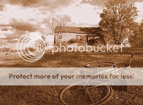
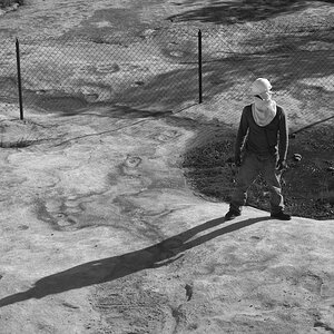
Don't you dare center that! Only improvement I would like to see is having the bike on the left side to provide a little more balance. Great shot though.
Eeek, NOT a fan of the hyper-saturated ones... Sometimes dialing the color down actually enhances the overall effect more. I like the bike shot, the composition on that is pretty good.
The only thing I would have changed with number one is to not have the rear tire cut off. I would have moved back just a touch to get the entire bike in there. Other than that it looks great.
Taking all of that into consideration, I went back to reshoot with the bike to the left and to get the whole tire. Alas, the bike was gone. I found that really strange since the pick was taken at an abandoned farm and the bike had been there for ages. Looks like that is the best it will ever be.
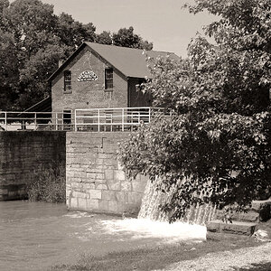
2. is good - decent composition, good color, and most importantly the image is uniform.
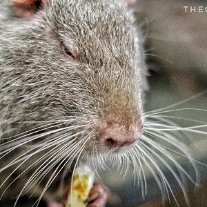
3. interesting color - bad angle - a different angle would really make this picture stand out.
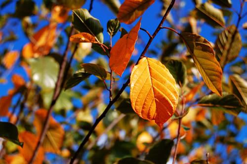
4. boring - your eye wants to focus on the background, then it's out of focus, so you look at the left side - which appears to be in focus to some degree, realize it isnt anything of importance, than you see the off center leaf - realize there are berries, but they are black, mundane.. kind of a cascade of disappointment. There is nothing wrong with the off center subject - its actually a very good strategy, but the subject of the photo should be interesting to some degree. Since the backdrop is brightly lit it gives the viewer a perception of happy and warm, however only to find the subject of the photo is black and cold. If this same leaf and berries were the subject in a darker colder environment - it would be much more appealing.
Pyrex, would it help if I named #4 "Cascade of Dissapointment" ? I am just a sucker from close shots, and I was happy to finally get DOF correct for once. But I do agree, nothing spectacular. Would it help if the background was darker? Also, on #3, what angle would you suggest? Without a ladder, it would seem difficult to get a different one. I suppose I could go back and try a straight on shot of it.
Pyrex, would it help if I named #4 "Cascade of Dissapointment" ? I am just a sucker from close shots, and I was happy to finally get DOF correct for once. But I do agree, nothing spectacular. Would it help if the background was darker? Also, on #3, what angle would you suggest? Without a ladder, it would seem difficult to get a different one. I suppose I could go back and try a straight on shot of it.

")
![[No title]](/data/xfmg/thumbnail/35/35880-9a6926237907ab72b42781d9a09698a6.jpg?1619737209)
![[No title]](/data/xfmg/thumbnail/33/33448-e22f202a6b3be7233dba294543198f2e.jpg?1619735973)

![[No title]](/data/xfmg/thumbnail/31/31979-ea92aca54ae865842d998c9cec534991.jpg?1619735137)