ive tried my hand at advertising. This is the first time ive tried it and know nothing other than pure instinct. Id be ever grateful for opinions on my attempt.
goldfinger is the name of a mandarin company lol. i was just eating one and then started to pile the skins on each other and thought it could then make a good picture...
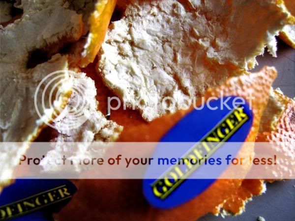
original
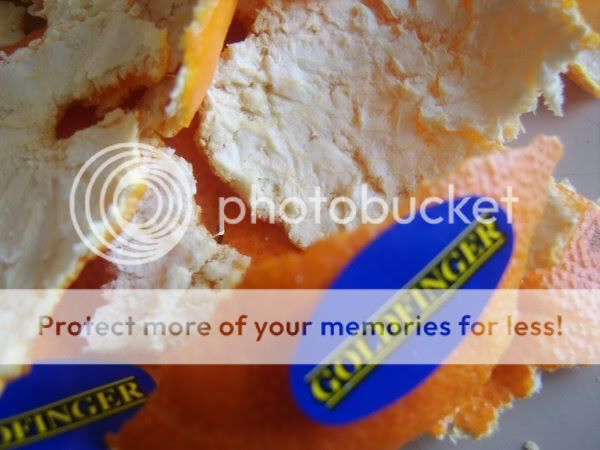
goldfinger is the name of a mandarin company lol. i was just eating one and then started to pile the skins on each other and thought it could then make a good picture...
original