Critique Please!

katy625

TPF Noob!
Joined
Jun 1, 2009
Messages
267
Reaction score
1
Location
Texas
Can others edit my Photos
Photos NOT OK to edit
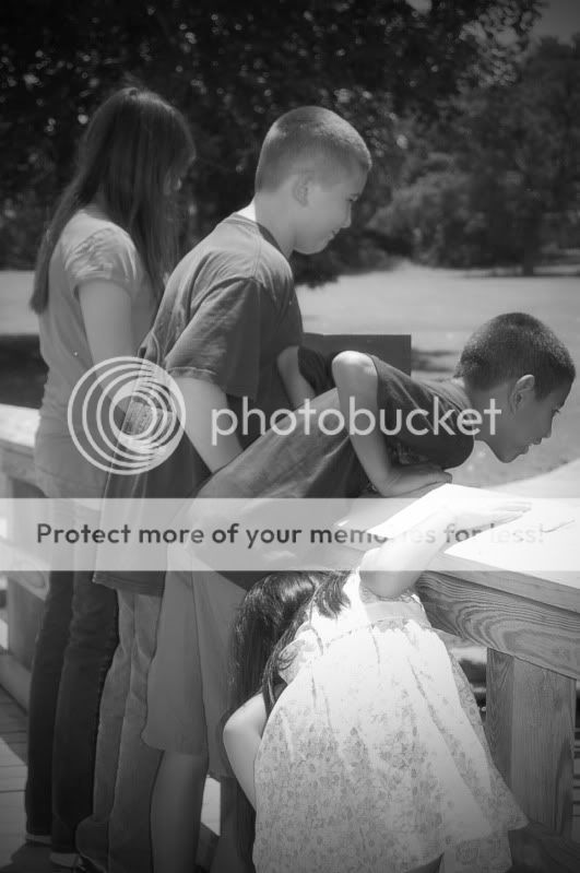
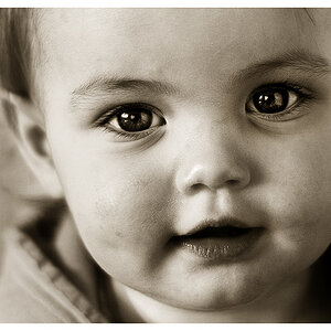
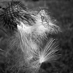
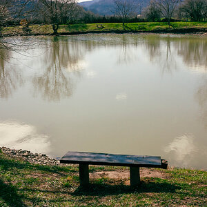
These are two of my most recent B&W pics I would like to have critiqued. I call the first one my money maker because I have got lots of bookings from just that one pic....let me know though because im not well versed with B&W

kidsonpond.jpg


edited3.jpg
 
Hmm, what kind of image effects did you apply to these ?

I actually do not find these appealing as B+W images.
 
Too bright with not enough shadows / contrast. No depth to the pictures. I hate giving crits like this.. but then again it is just my opinion as another person who is seeing your finished work. Try messing around with focal points and depth of field. Something as simple as the time of day or fstop can greatly affect the outcome!
 
As black & white images, they really lack a "punch" that can be had with blackand white portraits.

(I really know squat about portraits. Never liked doing them, or people for that matter, ha.)

The lighting is harsh, parts seem blown out, there is sort of a weird blur effect around the edges of the first. The second just seems really soft.


I think that may be a big part of it. I'm wondering the same thing.
 
Quite. That's been my default post every time I see B&W images now. It's a common issue.
 
I like the composition of these. But you need to work on your exposure. Try to avoid blown-out highlights. There are a number of ways you can do this. Buy a couple of books on your particular camera or on photography in general. If you have a recent digital model, this should be pretty easy. Study the your manual and/or books and play around with the settings.

Good luck!
 
I hate to have to agree with the comments here, but I do. Perhaps a simple suggestion. If it was color to begin with try a simple conversion over to gray scale and increase the contrast and play with the brightness a tad. While not ideally the way to go, i think you will have better results. The composition could also be better ''imo'' There is not enough empty space to the right. I believe the strict rule of thirds would help allot here. Just my opinions though.
 
Quite. That's been my default post every time I see B&W images now. It's a common issue.

Which I'm noticing...but yet I don't see anywhere that you are giving a tip or suggestion as to the right way to do it. Any help would be appreciated.
 
Okay everyone i am EXTREMELY appreciative for all of your help! Those were literally my 1st attempt at black and white. I have since studied an entire photoshop cs4 book and feel a little more educated now too. So, please view my new thread today and help me critique my newest attempt. I feel that it is much better.
 

Most reactions

Back
Top