Critiques welcome!

chall33

TPF Noob!
Joined
Nov 11, 2008
Messages
42
Reaction score
0
Can others edit my Photos
Photos OK to edit
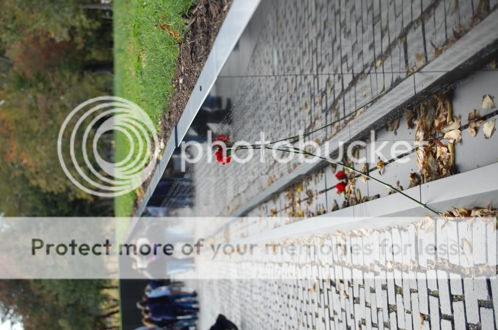
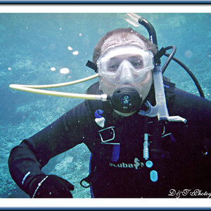
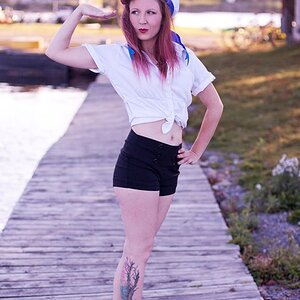
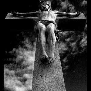
I'm new and I figured a good way to start was to have some of my photos evaluated to kind of see where I stand. If you haven't read my intro it pretty much says that I am very new to photography. I've always liked taking photos but I am just now trying to improve and learn more. I just got the D40 in June and thats what I used to take all of these shots. These are just a few of the hundreds I've taken just getting to know the camera. It's definitely a learning process!

DSC_0333.jpg


DSC_0337.jpg

ring.jpg

otisblkwht.jpg

otiswise.jpg

DSC_0044.jpg

DSC_0169.jpg
 
I'm in the same boat as you, always enjoyed photography and just bought a D60.

But, I think your photos look very nice. I can't seem to get my shots as bright.
 
Comments per req:

1. An interesting idea, but too underexposed, and with too much distracting background to really work. One of the difficult things about learning photography is being able to distinguish scenes that should make a good photograph from those that do.

2. Much nicer. I'd brighten this up a little in post, and perhaps increase the saturation slightly as well. Additionally, I'd suggest cropping the OOF portions at top and bottom as they really add little to this image. Lastly it needs to be levelled; all the water is running out of the picture and on to my desk.

3. Very nicely done; good focus, nice exposure and good tones/colour. I think perhaps a shooting position slightly higher which showed more detail of the ring might have worked, but as-is, a very good capture.

4. Nice pose. In this case the OOF muzzle and the bright area image left (window?) are both very strong, and distracting elements. The dog has a very expressive face, and this would be well worth reshooting in better lighting conditions.

5. Cute, but I think you missed the focus slightly. Remember the eyes are the critical point in any portrait (animal or human) and in this case the sharp focus looks to be around the nose. Also note your background; while you've made good use of selective focus, the background is still focused enough to very distracting. This image also needs to be leveled.

6. There was potential in this image, but with a 1/2 second exposure, the time was just too long and the movement of the person in the foreground is rather distracting. Good use of the curve to lead the eye, but there's no real main subject.

7. Good idea, but IMO, not quite the right shooting position. You have two major distractions; the OOF people image left and the treeline above. I think that perhaps shooting from a slightly lower position and zooming/cropping sot hat the distracting elements were removed and that some of the names were legible would have benefitted the image. As well, the use of a polarizing filter would have removed the reflections from the wall itself.

Just my $00.02 worth - your mileage may vary.

~John
 
tired iron, thanks so much for your input. i really see where improvement is necessary. You gave me lots to think about and remember for the future. it is very much appreciated.
 
3- I like this alot. If it was a colour or b&w, maybe not so much.

7- this one is my fav. it has red, black and green put together nicely. the soil or whatever that borders the granite(is it granite) and the grass is nice too. im not a big fan of that guys shoes though, but i like how the people are there.

i also dont like the trees being there. crop? maybe go lower? its also a little underexposed imo. very little. maybe 1/100 instead? thats just me.

also, maybe the rose could be layed on the ground? standing up doesnt feel too apealing for me. it seems "tainted" with it standing up.
 

Most reactions

Back
Top