Dance/Toe Photos in the City *pic heavy*

Geaux

No longer a newbie, moving up!
Joined
Feb 21, 2010
Messages
2,522
Reaction score
464
Location
New Orleans, LA
Can others edit my Photos
Photos OK to edit
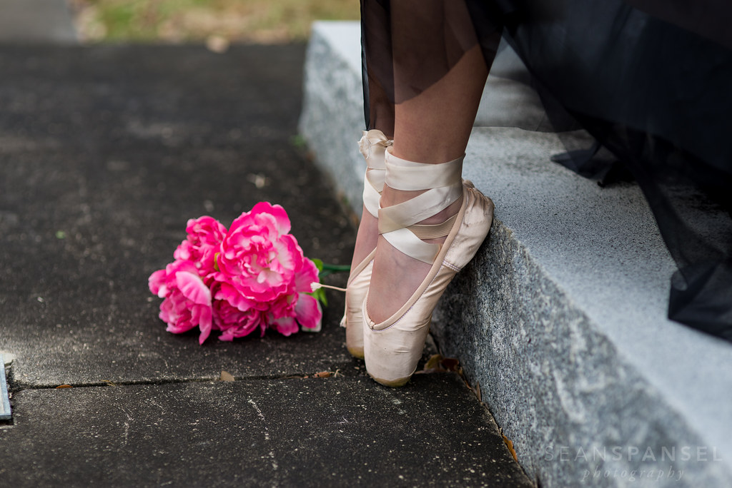
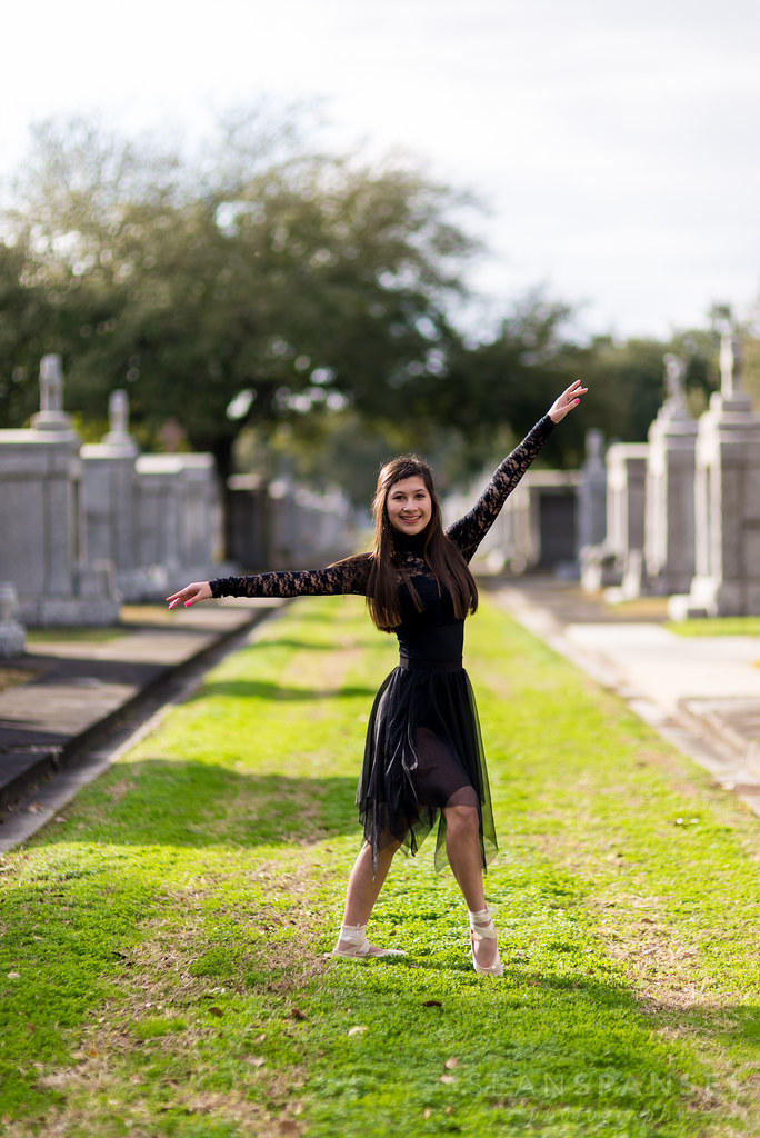
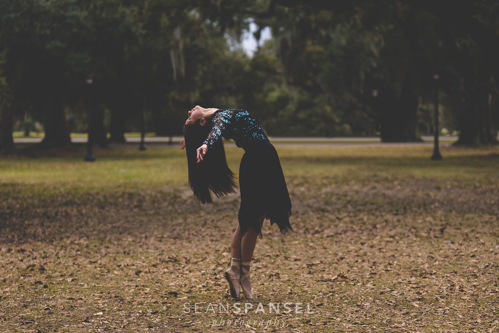
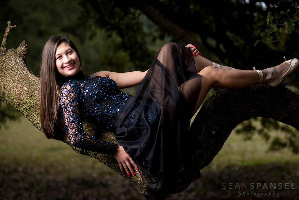
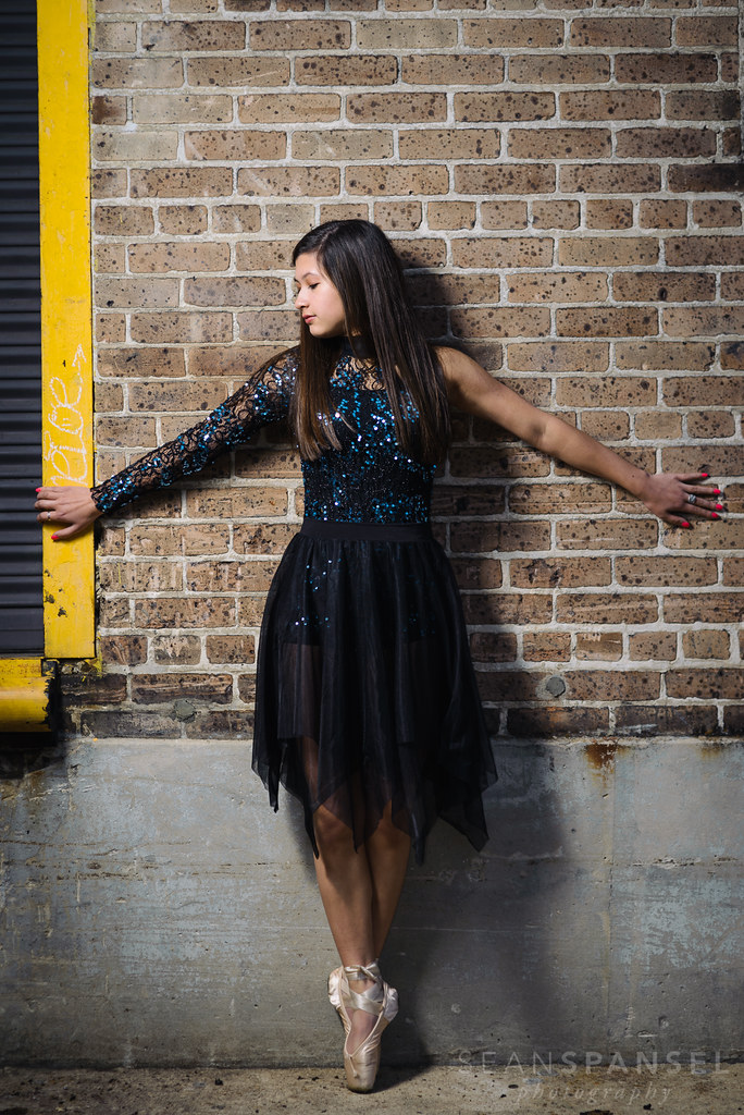
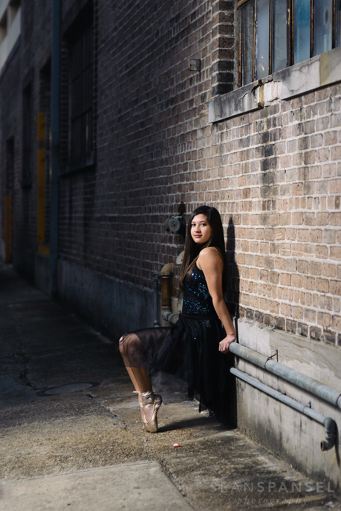
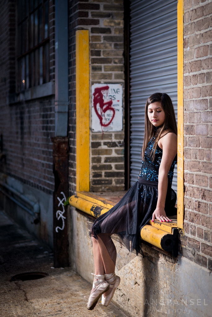
Niece asked me to do some toe pictures for her while in town and while PEOPLE are not my 1st choice in pictures, I was glad and honored she wanted me to shots of her. Let me know what you think.

1
Cemetery Toe Shoot by NOLA_2T, on Flickr

2
Untitled by NOLA_2T, on Flickr

3
Untitled by NOLA_2T, on Flickr

4
Untitled by NOLA_2T, on Flickr

5
Untitled by NOLA_2T, on Flickr

6
Untitled by NOLA_2T, on Flickr

7
Untitled by NOLA_2T, on Flickr

8
Untitled by NOLA_2T, on Flickr

9
Untitled by NOLA_2T, on Flickr
 
very nice.
too many for me to go through detailed critique on each one, but ill hit a few that stand out.
#1 just screams portrait orientation to me. nothing going on L or R sides that add to the photo. Beautiful otherwise.
#2 is nice with the flower, but I might have cropped that one a little tighter.
#3 is beautiful, but a little too much sky.
#4 would have been absolutely beautiful if you hadn't muted all the wonderful color from #3. as it stands, it just looks underexposed.
#7 and #8 are nice, but again, i think they need a bit tighter crop.
#9 is really cool...buuuuuut...honestly, the two dumpsters in the background kinda kill it for me.

I guess maybe you were going for...urban? maybe?
it just seems like not an ideal location for a ballerina shoot. know what i mean?

overall a nice set if you dont mind a back alley for a ballerina shoot.
 
Yeah, we wanted to think out the box and put the ballerina in areas where you wouldn't normally find one. Niece begged to go downtown to do the shots in that alley, so we made that our last stop.

I just went back and looked at the unmuted #4 and honestly, the shot just didn't pop or stand out to me in it's colored version. I still have it for them if they ever wanted to print it, instead of the muted, but gave them options.

#1, the reason I chose the landscape was because the portrait left too much room top and bottom and I really wanted to keep the full bottom step in the shot (was shooting 85mm and already backed up against a grave on other side of her)
We later found a smaller tomb to take a shot in portrait in front of:
[url=https://flic.kr/p/qyEreH]Untitled by NOLA_2T, on Flickr[/URL]

Appreciate all the other input b/c cropping is one of those things where I struggle.
 
Last edited:
I like how you got your name carved into solid granite.

#6 is my favorite, but all are very good.

#10 I think you should clone out the deceased's name. The large family name on top is o.k. however.

You could tell people you went all the way to "Balmer Merlin" to get that shot.
 
I will leave the c&c up to the experts, but let me say: scrolling through, the last one made me stop and say "Wow'" definitely my favorite of the set!
 
I like how you got your name carved into solid granite.

#6 is my favorite, but all are very good.

#10 I think you should clone out the deceased's name. The large family name on top is o.k. however.

You could tell people you went all the way to "Balmer Merlin" to get that shot.

I've gotten rid of the deceased's name, good eye. I didn't even think anything of it, honestly, but if it's going to be online..you are right.

Thanks
 
#4 kinda flat.

Really like #6, I saved it to look at once in a while. All nice pix!

You did a good job posing. I'm a doc photog and no good at posing. Wish I did better, but I'll keep my doc skills over posing skills in any case.
 
I like #9. It's the unexpected location of the grand jeté that makes it. In my mind I'd have cropped it with a little less room on the left and a little more on the right. If you get the chance to shoot her again have you considered trying a grand jeté using a slow shutter speed and rear curtain flash? :)
 
Last edited:
happy you posted these. Much more my speed than what is usually on here. you made my night.:bouncingsmileys: As mentioned there are some things that could be corrected. But really for being out of a studio in the streets I think these came out rather well. Like the setting it gives it a oddity and interest though not ideal. would prefer a better setting but really the blend with street does give it a certain appeal. Nice work, she makes a good subject. looks like you had fun!
 
On 2nd viewing I really like #4, too. although it's a bit flat (as pointed out above). I decided to have a go at it in LR, I re-cropped so that her throat is at the top left 1/3 cross point, made it a square crop and then played with sliders and gave it a slight vignette. That's my 2 pennyworth - bear in mind that I was working from a fairly small Jpg rather than a RAW file. I may have overdone the blacks but...
(I love dance photos!)

Dancer-.jpg
 
I actually really liked 4.
 
I also love 4. I would probably lighten the shadows on her hair and dress. As is it seems like there is no detail.


Sent from my iPhone using Tapatalk
 
Some really great ones in there.

I was wondering how the first one would do in black and white.
 

Most reactions

New Topics

Back
Top