Daughters wedding: Looking for some thoughts and input

Rick58

Been spending a lot of time on here!
Joined
Jun 23, 2012
Messages
4,227
Reaction score
1,473
Location
Reading, Pa
Can others edit my Photos
Photos OK to edit
2_zps85f656ab.jpg

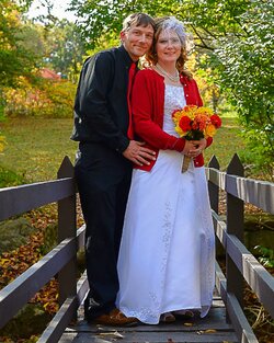
I've never been a people photographer and don't pretend to be, but I took this at my daughters wedding and was looking for some input. Thoughts anyone?
 
ouch! sorry about the size. I've been away for a while and forgot to adjust the size
 
I think it looks good. I'm not a wedding photographer though.
 
Same here Rick. Neither am I so I expect to leave here licking my wounds...LOL
 
Rick!! Hey there!!

Oh yeah, the photo. I am not a people photographer either, so take this for what it's worth, but I think it's a lovely photo. Great colors, nice exposure, good detail. And they look really happy so you captured emotion.

Seems like a winner to me :)
 
Just a couple of things I noticed. One, it looks like her veil is in focus and her eyes aren't. Second, the white balance is off, as I'm sure her dress is white and not a slight variation of light blue/grey. Third, the background is lighter than the subject. A reflector or fill light would have improved the shot. The last two you can adjust in post.

There is no shame in trying something that you don't usually do....and then not being the best in the world at it. Its a nice shot of your daughter's wedding.
 
Looks like a very happy couple, congratulations!
 
Congratulations to her and her new husband. I like the way you composed it and I think the bridge is a good idea (visually and symbolically). I'll go with Amanda on white balance and some fill lighting.

Overall, I think you did fine for your first attempt.
 
Hi Leonore! I've been busy with things this summer away form the camera. I'm hoping life begins to slow down a little in the next month of so. It thought this fell into the "just ok" department until a Read Amanda's comments. Then...

Thanks for the input Amanda. Until you mentioned it, I never even saw the blue overcast. What a difference a few sliders make! I guess that's why a do B&W barns...LOL. I don't quite get the focus thing, but I see what you're saying. I was shooting at 5.6 @ 1/800 at probably 20-25 ft with my 50 prime. I should have had plenty DOF and 1/800th should have stopped a race horse. I'm really not sure what happened there.

I dropped the ball on a couple things that day. Previously I was playing a round at a family picnic and put the camera on jpg only. More for an experiment then anything. Never reset it. Next we were in and out of dark shadows during the day so I bumped the ISO's up to 800. I didn't need 1/800 for these shots and should have backed it off. Lessons learned.

Thank's everyone for the thoughts. It was a nice day. My daughter got a good husband and I got a good son-in-law
 
It's a good shot, and one which she will doubtless treasure since Dad took it.
From a portrait photographer's perspective, I dislike the 'leaning in' pose. What I might have done is have him stand straight beside her, and then flex his knees just a bit to bring his head closer to hers (and cropped the picture in post, mid-thigh).

I like the way you've used leading lines, and the expressions are great, and the natural sidelight works. I think if you'd added just a little squirt of fill from your speedlight, you'd have nailed the exposure. As-is, she's a bit racoony-eyed.


Those minor nits aside, nicely done!
 
Hi John and thanks for the input. I definitely agree with the leaning. It almost appears he's attempting to fit into the frame instead of the "closeness" I was looking for, and another hit on the fill flash. I've never messed around with daylight flash. It might be worth working on. All good points from everyone. I have 4 kids, all now married so hopefully I won't get any more practice in the near future...LOL
 
Rick, I would agree with what Amanda and John have mentioned. I did bring it into LR4 and did an auto WB and tweaked the sliders a bit. I also used the adjustment brush with lighten to paint some light into the faces of both of them. (The auto WB said to +6 on the Temp, -5 on the Tint. I added +2 contrast, -50 on the highlights, +5 on whites and -5 on the blacks and +5 on clarity. Oh on the lightening brush, it was +0.25 exposure and +40 on the shadows.)

2_zps85f656ab-2.jpg
 
The leaning in was the first thing that struck me because it was so unnatural looking. I was thinking, like John, that a crop might look better so I gave it a shot maintaining your aspect ratio.

2_zps85f656ab-Edit.jpg
 
Thanks guys! I like your crop Ron. It focuses more on the subject plus you cleared out a big chunk of that blown out sky. Nice.
 

Most reactions

Back
Top