Deena and Ben Engagements

twocolor

No longer a newbie, moving up!
Joined
Feb 26, 2008
Messages
1,044
Reaction score
227
Location
Utah
Website
www.twocolorphotography.com
Can others edit my Photos
Photos NOT OK to edit
Well, the summer bride influx has slowed, and I just finished the PP on Deena and Ben's wedding pis. Upon inspection, I learned I hadn't posted their engagements on the forum yet. So, I'll post them at the same time even though there was 2 months between the two!

1. I think the coloring is off on this. It was shot during the "Golden hour", and I don't feel like its warm enough light on their faces???
2904173241_e7e2e99b01.jpg


2.
2904172945_7a4c10b29a.jpg


3. One of my personal faves ;D
2904172605_aefecb34b2.jpg


4.
2905015780_f272f9775d.jpg


5.
2904172035_06555b1a8e.jpg


6. I like this one because every time I look at their faces I think "ooooohh how cute!"
2905015090_5e24f63184.jpg


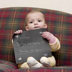
7. This is the one picked for their announcements
2905014832_ecd9aa078b.jpg


Let me know you honest opinions, and be watching for Deena and Ben Wedding too!
 
Nice series.

I know you said #3 is one of your favorites, but I don't really like that one. The perspective makes her arm look huge in comparison to their faces.

This makes me think that all/most of them could have been improved if they had been wearing long sleeves. With short sleeves, their arms are just as bright as their faces, and therefore competing with the faces for the viewer's attention.

That being said, the short sleeves do work because they are both wearing them and it's a nice casual look for them.
 
#1 is sweet. I agree with Big Mike about the arm looking big in #3. #4 I'm not a big fan of how most of the picture is wood and they are just in a small cut off corner. #5 is nice. #6 I would like to be either zoomed in or backed out a little to get more of the barn. It is just too much wood for me and takes the focus away. #7 is really cute.
 
Nice series.

I know you said #3 is one of your favorites, but I don't really like that one. The perspective makes her arm look huge in comparison to their faces.

This makes me think that all/most of them could have been improved if they had been wearing long sleeves. With short sleeves, their arms are just as bright as their faces, and therefore competing with the faces for the viewer's attention.

That being said, the short sleeves do work because they are both wearing them and it's a nice casual look for them.

Thanks alot Big Mike now I can't help but think she has giant arms!!:lol: I actually just got back from a convention where one of the speakers suggested telling your clients not to wear short sleeves or shorts - he stated the same reason. To much competition to their faces. I'm not very good at "suggesting" what clothes to have someone wear!
 
#1 is sweet. I agree with Big Mike about the arm looking big in #3. #4 I'm not a big fan of how most of the picture is wood and they are just in a small cut off corner. #5 is nice. #6 I would like to be either zoomed in or backed out a little to get more of the barn. It is just too much wood for me and takes the focus away. #7 is really cute.

I actually was going for a natrual framing type look with the barn door. I do have a few where I backed out and got the whole barn, but their faces are really lost in those ones. Maybe zooming in would still give the feel I was going for . . .
 
Try not to put so much angle in your pictures. I have to lean my head too far

I actually was going for a less traditional look in these photos. I thought I didn't do to bad, I only posted two with angles. I try to give them a good variety. The client buys more when they see alot of variety, I think they feel like they will miss out if they don't have something of everything!
 

Most reactions

Back
Top