DigitalDiva
TPF Noob!
- Joined
- Apr 15, 2007
- Messages
- 309
- Reaction score
- 0
- Location
- The Netherlands
- Can others edit my Photos
- Photos NOT OK to edit
Follow along with the video below to see how to install our site as a web app on your home screen.

Note: This feature currently requires accessing the site using the built-in Safari browser.

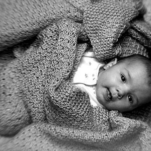
") Not everybody needs to be perfectly proportioned for a portrait to be a success, imo anyway. I also have a personal ethic that I prefer to shoot real people and not model-type people for the most part because I want to get away from the thing that everybody does and help to produce images where real people can make beautiful subjects, too.
Not everybody needs to be perfectly proportioned for a portrait to be a success, imo anyway. I also have a personal ethic that I prefer to shoot real people and not model-type people for the most part because I want to get away from the thing that everybody does and help to produce images where real people can make beautiful subjects, too.Now let me defend my opinion. I have no idea what your professor was thinking, but I don't see the line doing anything but distracting from you image. You certainly didn't have it in mind when you shot the image, so what part of you "vision" does it play? Personally I don't have a vision, I shoot pictures. I have the studio not the artist mind set so forgive me for disagreeing with an academic.

Fair enough. And I expect you knew what I meant by defects...