Desolate

errant_star

TPF Noob!
Joined
Aug 27, 2004
Messages
1,028
Reaction score
25
Location
Ontario Canada
Website
www.jenkanderson.com
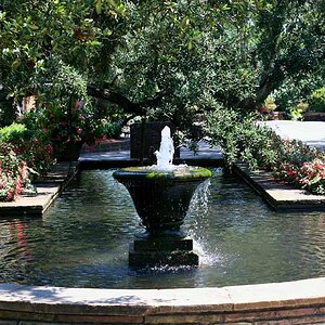
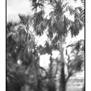
Some of you may remember a couple of colour shots I posted in the photo gallery a week or so ago ... from a foggy day we'd had ... this is one I preferred in black and white ...

is the overhanging branch too distracting? ... should it stay or go? ...

foggy_day_gate.sized.jpg


foggy_day_gateb.sized.jpg


All comments and crit welcome


Jen
 
i don't think I ever saw the color versions, but this one looks really nice as it is.... about that branch, I'd have to see it without it first... if you do decide to clone it out, post up the new version, i'd like to compare and stuff.

overall i like it! :)
 
I would also need to see it without to be sure, but I think the branch helps. My first response was that the problem would be the backgroung being fogged, but then I got an appeal to the feeling of the right half of the photo, sort of mysterious and empty. The branch sort of helps cut the left half of the photo off.
 
Thanks for all your comments everyone ...

I've added an edited version with the overhanging branch cloned out and now that I see them side by side I definately like the edited version best.

Thanks again :mrgreen:

Jen
 
I dont mind the branch in the first, gives me the feeling of standing under the tree and looking out. The second is a "cleaner" photo w/out the branch. Both versions are great,IMO.

I have started adding frames(borders) to my photos, and I like the thin white inside the wider border in the second.


Like I said, like 'em both, :thumbup:
 
I really like the 2nd one better, and the border adds a very nice touch. Classy and helps the photo look complete.
 
i like it better without the branch for sure. the fog is neat. and your framing in the second is something I hope you won't mind me copying for my next post.
 
Lose the branch, great, but I suggest you also crop off some of the bland sky.
 
Good shot. I agree with the majority in that the branch in the left upper corner is a distraction. I like the edit much better. Nice job.
 
Thanks everyone for all your comments ... i definately like the newer one better but I think I'm happy with the amount of sky there is Kodan_Txips. Thanks for your 2 cents though :mrgreen: Jen
 

Most reactions

New Topics

Back
Top