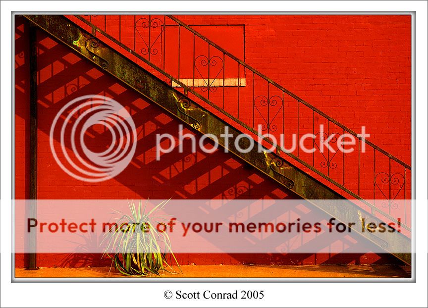
I've been really interested with cross-processed photos lately, and I decided I'd try it out on PS. I saw this scene earlier today and figured it would be the perfect candidate. Did I go too far with the colors?
color manipulation and the arty look it produces will vary between viewers, therefore i'd be interested in the responses you receive. i for one like your result, but it needs rotating a smidge.
But what exactly did you do? It looks like an image that had its saturation boosted at this point. I've personally not done it with film, but those "cross-processed" results usually show exaggeratedly "unreal" colors for the scene depicted....while here, the plant is still green and the colors appear normal to the scene. The strip of orange along the bottom isn't overpowering enough to call attention to your process.
That said, I do like the image, and the strong red of the wall is very appealing. The compostion is strong, as well, with all those diagonal lines and shadows. Um, as JonMikal mentioned, maybe 1 or 2 degrees CW would straighten out the horizon a bit.
I'd like to see the original so I can better appreciate what you've achieved.
I like the end result. The colors are bold and bright which really adds interest to the image. The red wall is a slight bit bold for my liking and make me look away often.
Whoops... you're right, it is a bit off-kilter. I edited the shot.
You're right, Terri, I pretty much just bumped the saturation on the yellows and reds for this one. On second inspection, the colors aren't really that "unreal," per se. I guess I was just going for garish oversaturation. Perhaps I'll mess around with it a bit more.
I like the end result. The colors are bold and bright which really adds interest to the image. The red wall is a slight bit bold for my liking and make me look away often.
i would say, based on the original shot, that this was simply bumping sat and some levels instead of cross processing.....although it does have a bit of that feel to it. why not take your first post and cross process it...
Whoops... you're right, it is a bit off-kilter. I edited the shot.
You're right, Terri, I pretty much just bumped the saturation on the yellows and reds for this one. On second inspection, the colors aren't really that "unreal," per se. I guess I was just going for garish oversaturation. Perhaps I'll mess around with it a bit more.
I've seen "garish oversaturation" done with PS and trust me, this isn't it. It's when folks want realism but push it past the point of believability that I find distasteful - it's gone past hue intensity into fluorescent. You've not done that here; it more resembles a saturated slide film, which makes it still believable.
Looks much better straightened, as well. :thumbup:
I think the term "cross-processing" is what threw me here.
I really like this Scott! And especially like it more seeing the first. On DA when I first saw it I didn't even think it was manipulated so there you go It's believable IMO! I thought someone just really preffered bright paints
Anyway, love the compostion here as well, it's a very nice scene and I just love the shadow of the staircase. You're more of a PS guru than you give yourself credit for Glad to see something new from you
I do like the end result with a mixture of colors and the richness of them. The range of color is also appealing to me. While I do look away from the bright red often I keep looking back as it interests me. I can respect we have a different appreciation for bold colors while still appreciating the image itself.

")

 You've not done that here; it more resembles a saturated slide film, which makes it still believable.


![[No title]](/data/xfmg/thumbnail/41/41492-467958db3420bceb7ab410a12dcc681f.jpg?1619739819)